Optimal qualitative colour palettes
My take at color palettes
I became dissatisfied with the color palette choices for the scientific visualization, so I have created my own tool to do that. I open-sourced the optimization code on Github; below I provide a short description of the results.
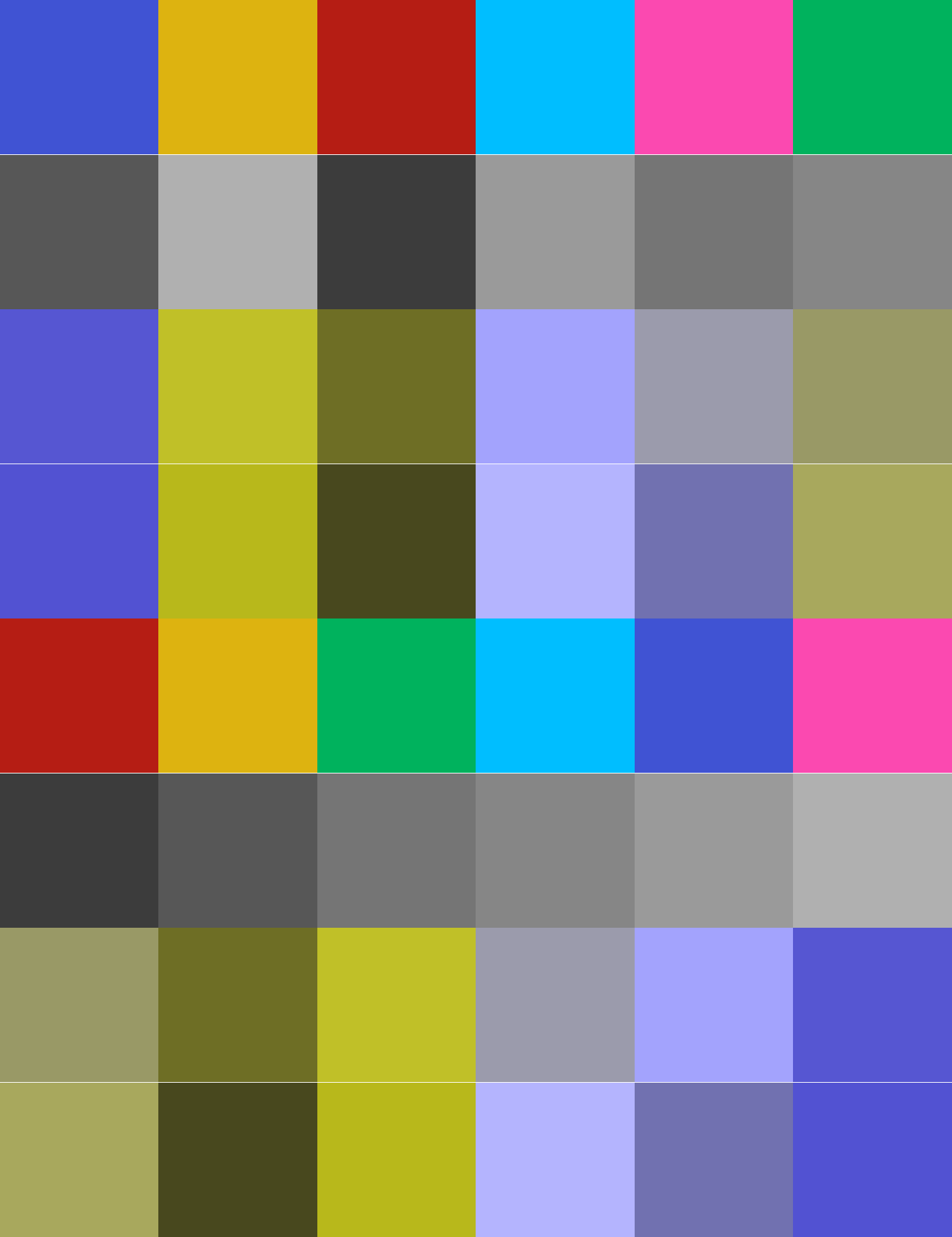
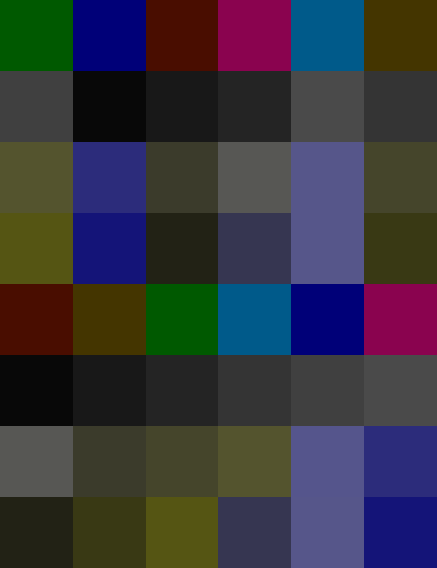
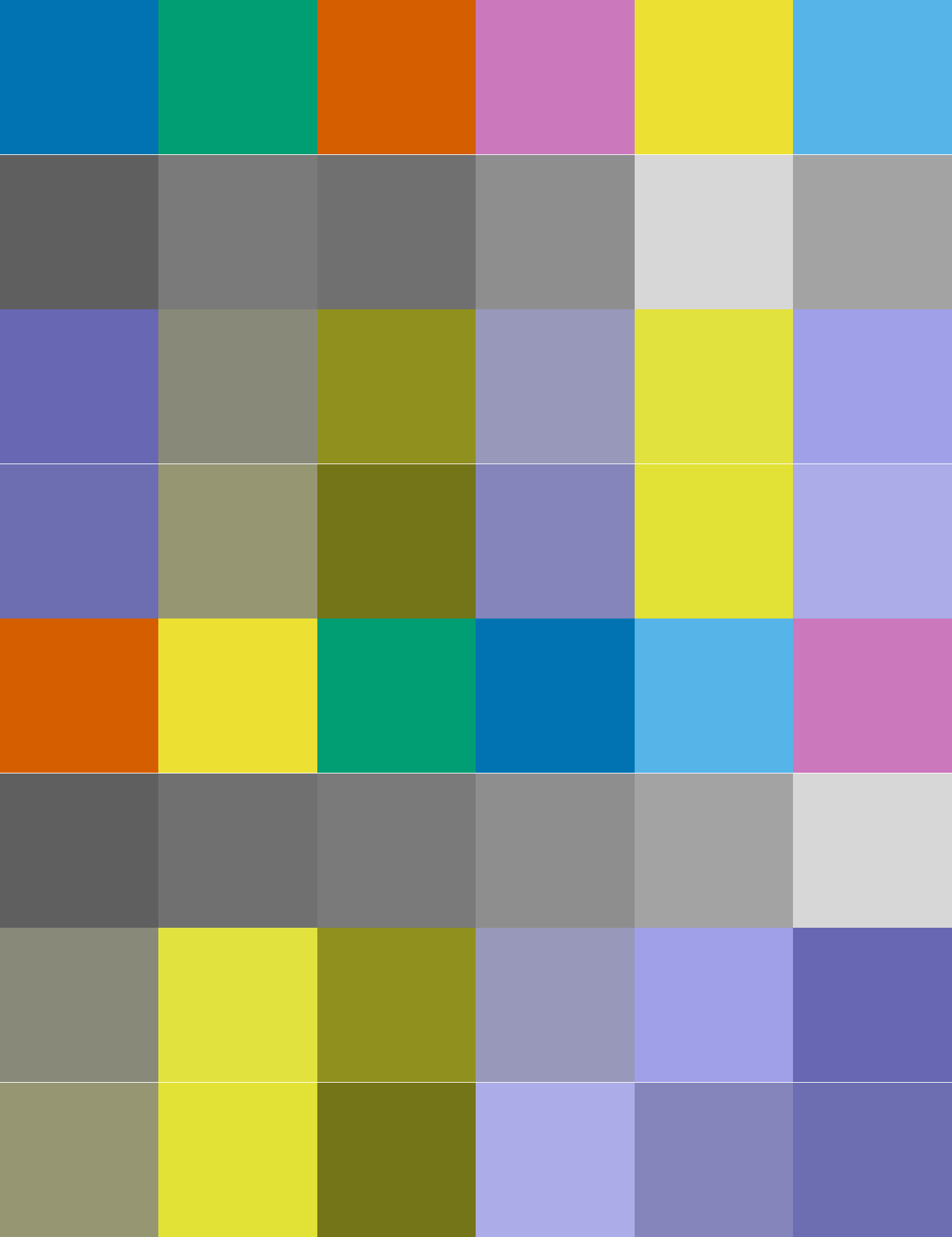
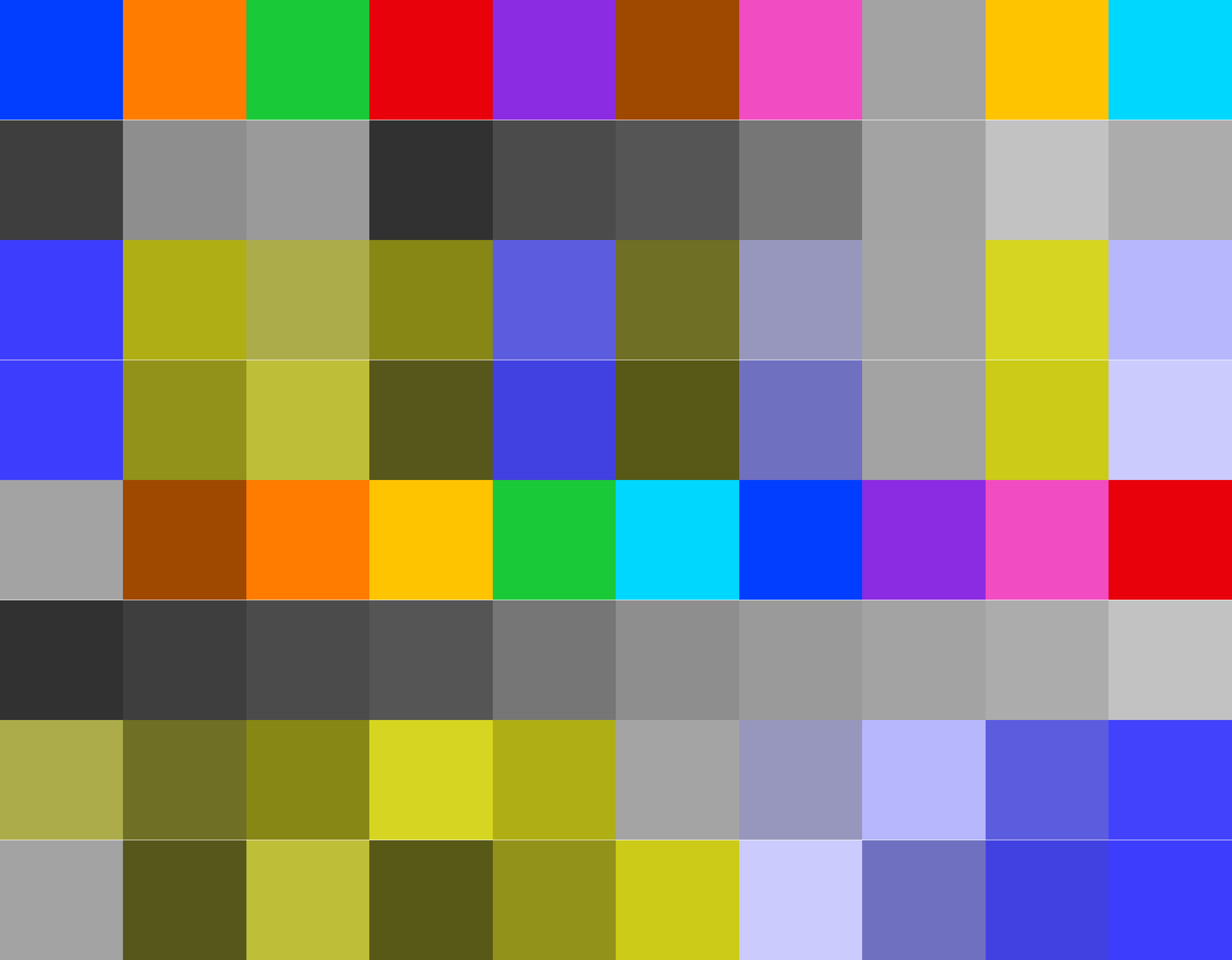
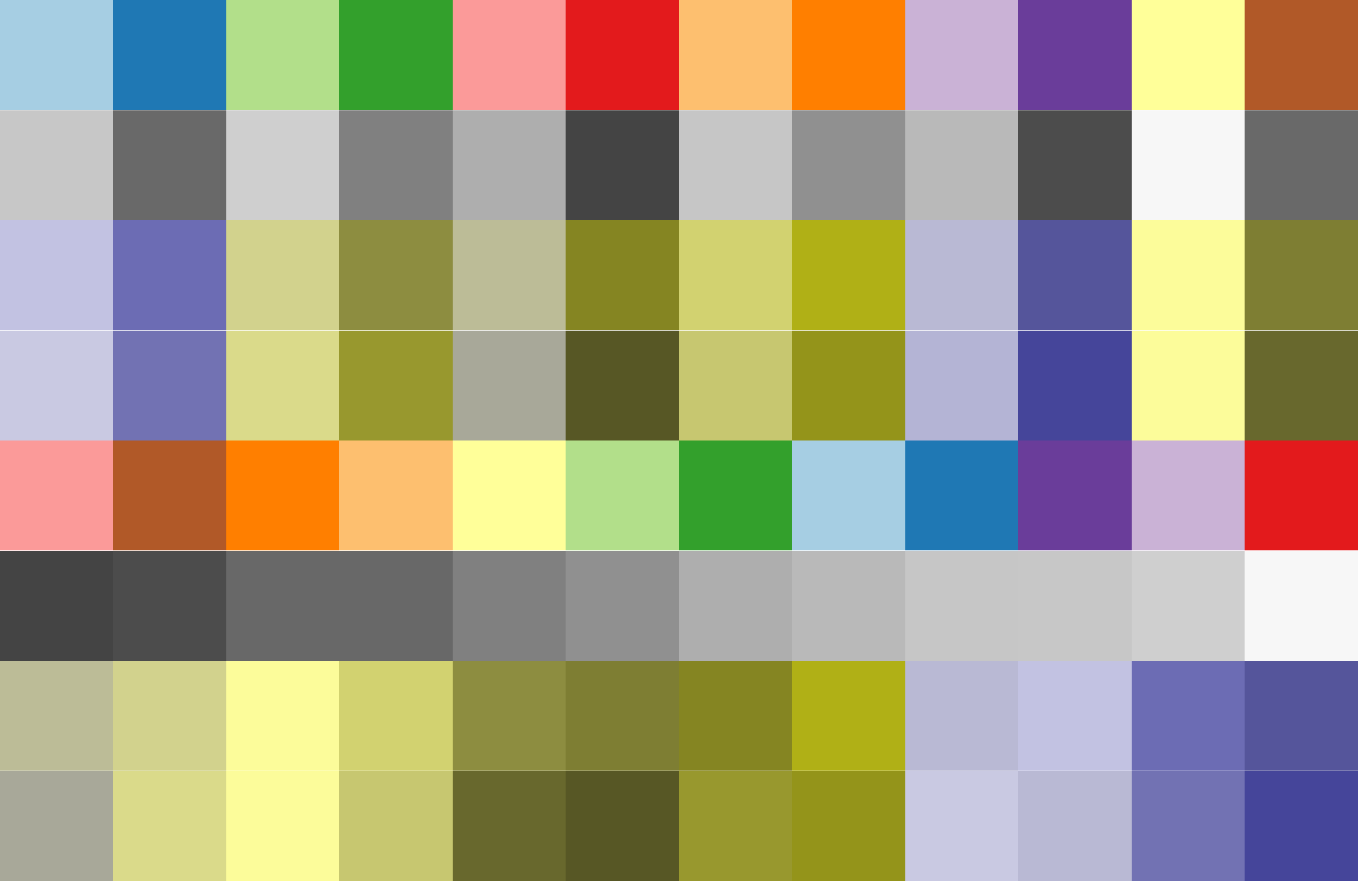
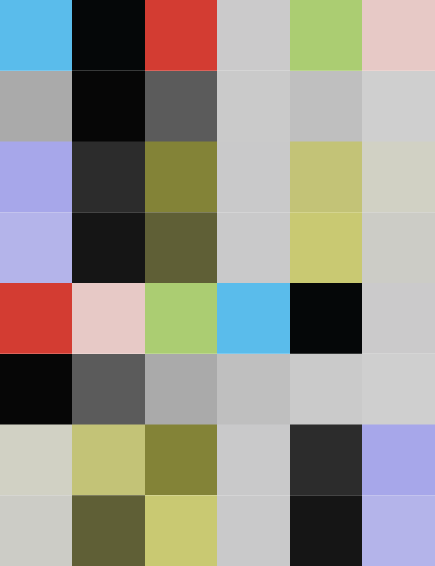
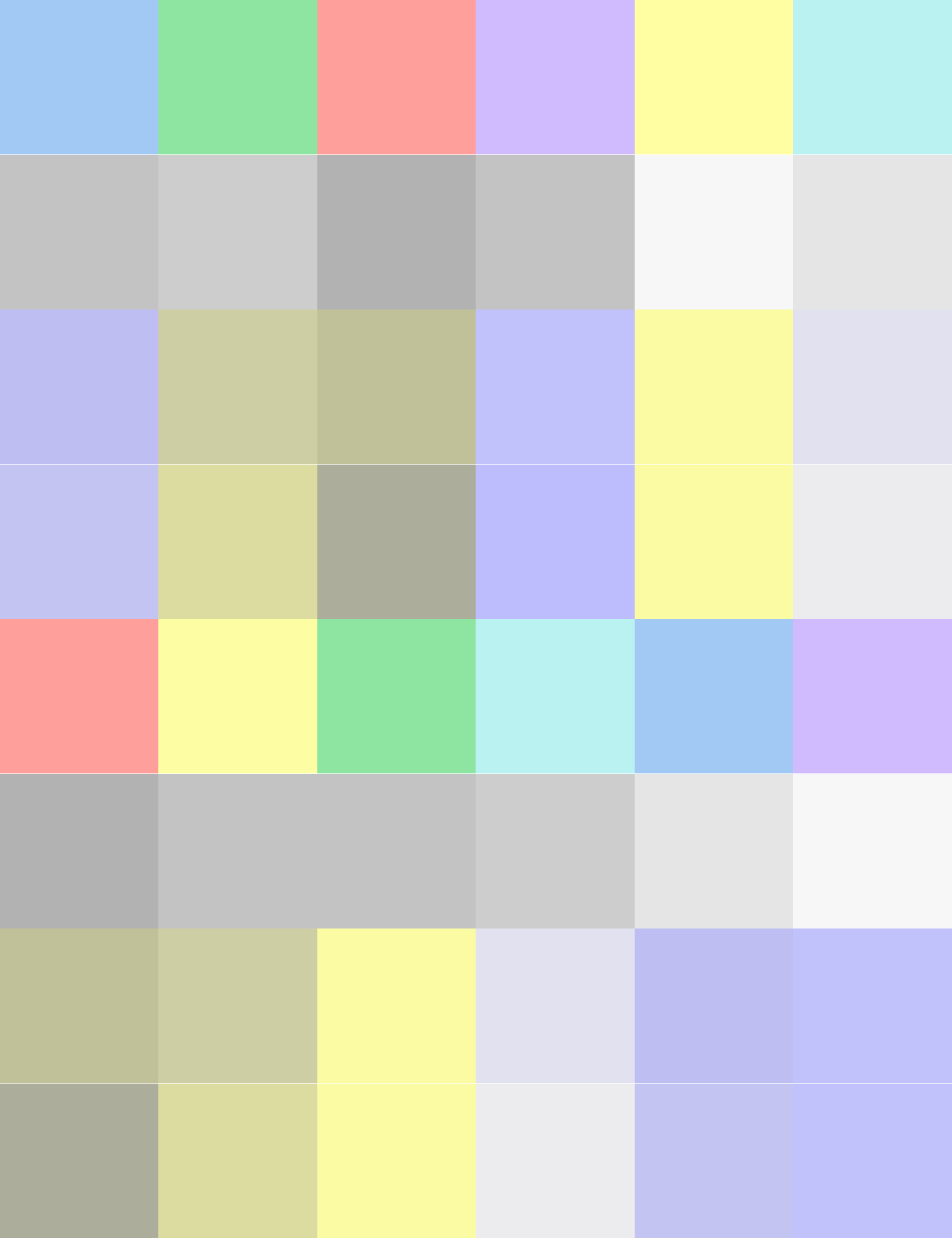
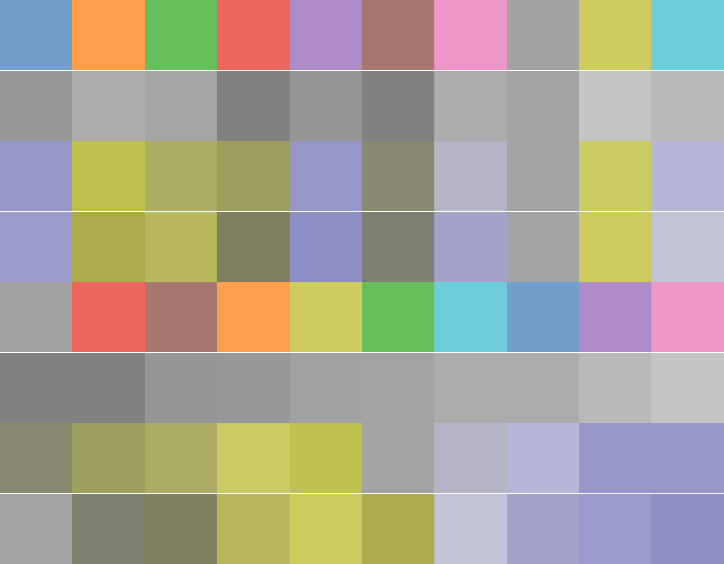
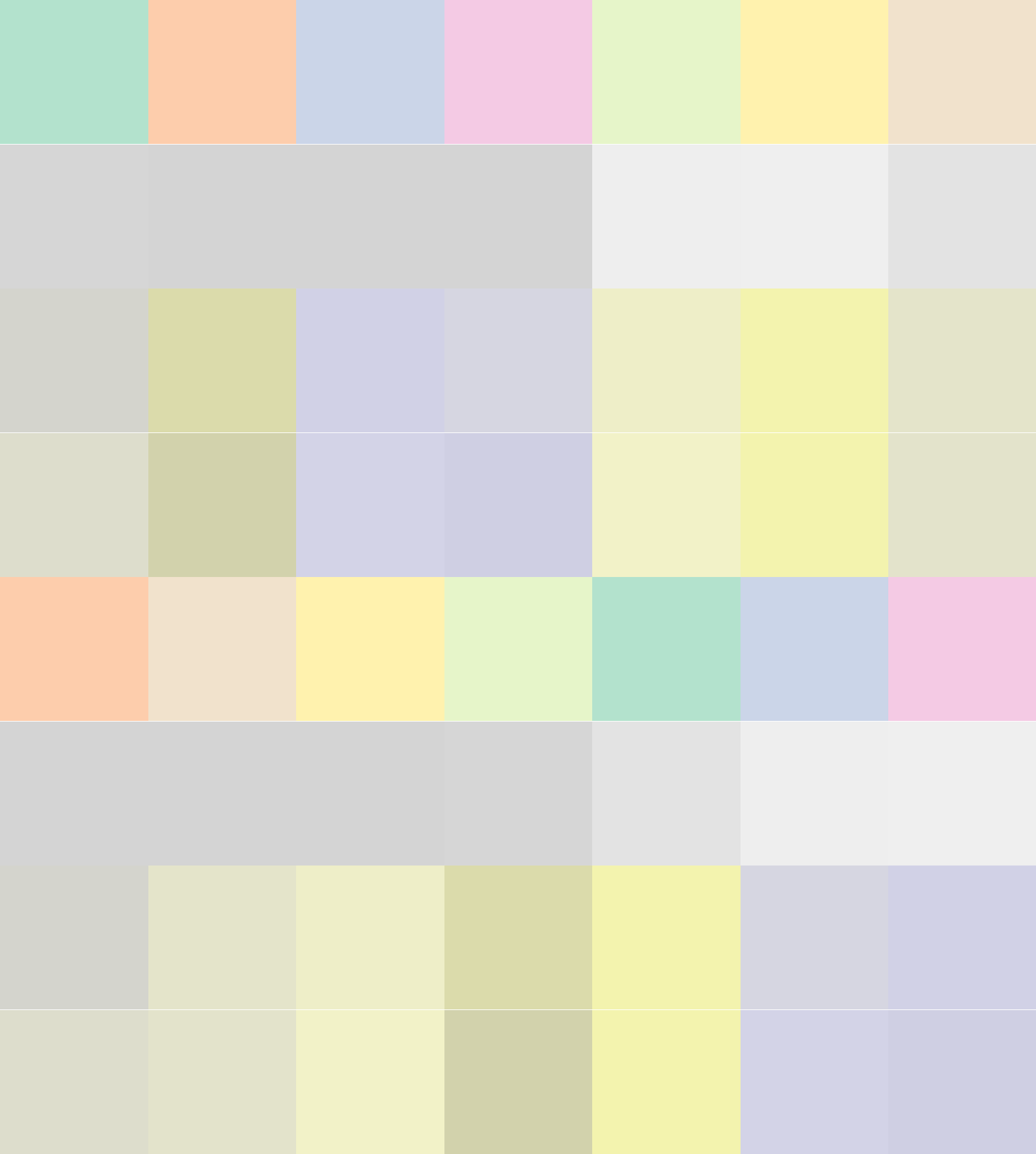
My default is a 6-color normal palette. Large (12-color) one is designed specifically for the case if one needs to fit more than 6 colors (which is bad practice, anyway). Bright is for dark backgrounds, it features colors syntactically similar to the normal palette – they are meant to be used together. Dark is to be used as a background for text typeset in white.
Normal, 6 colors Normal, 12 colors Bright, 6 colors Dark, 6 colors


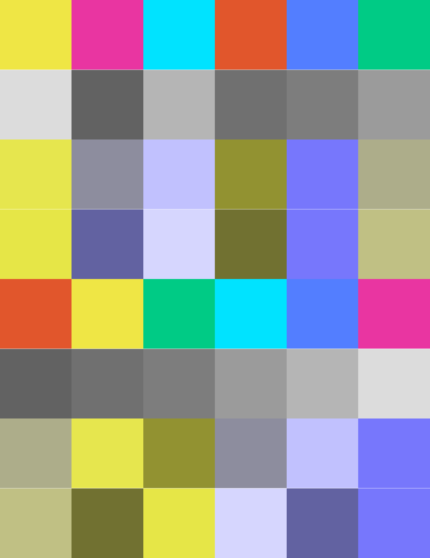
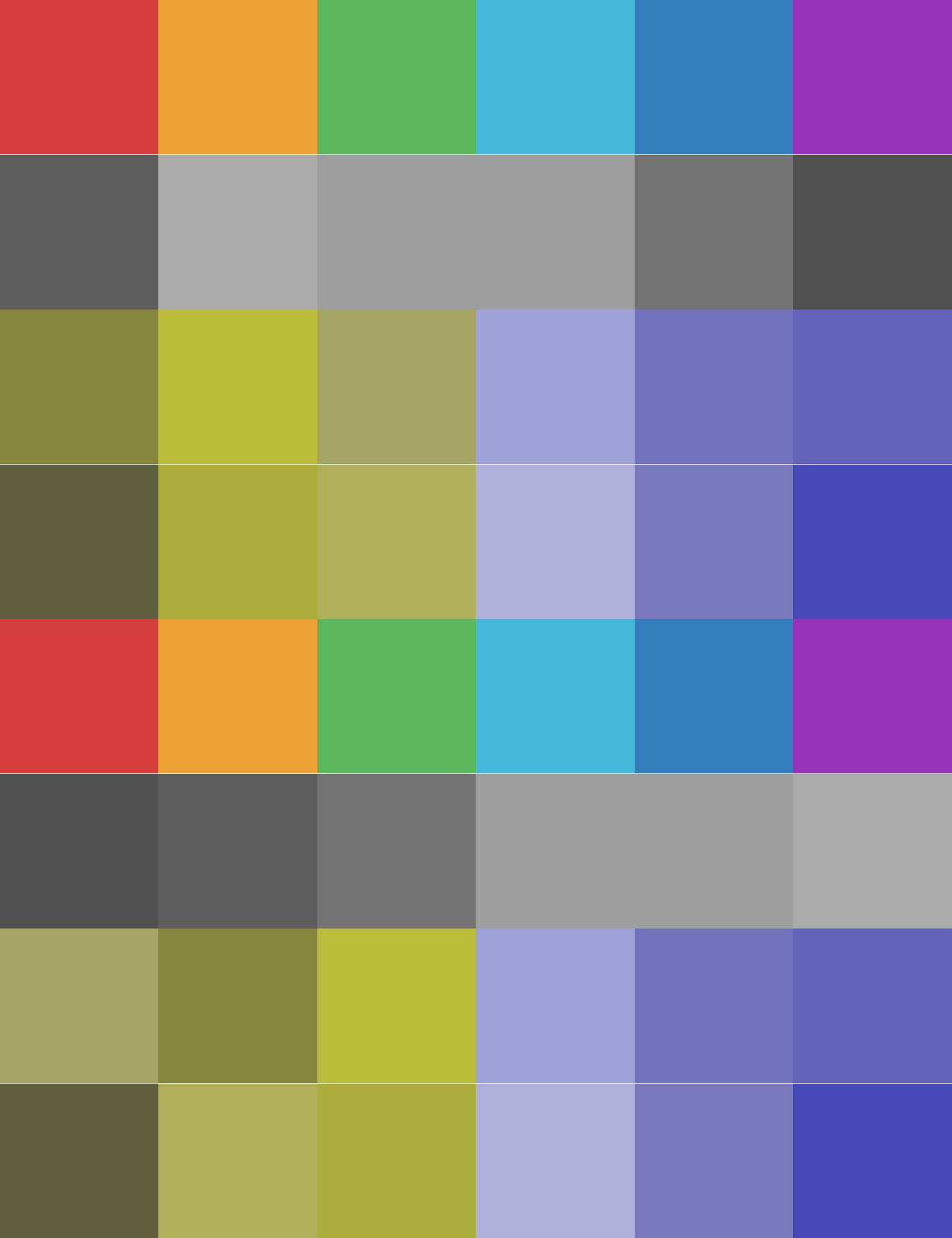
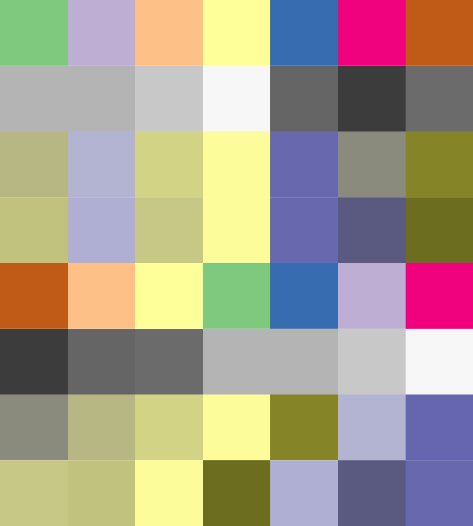
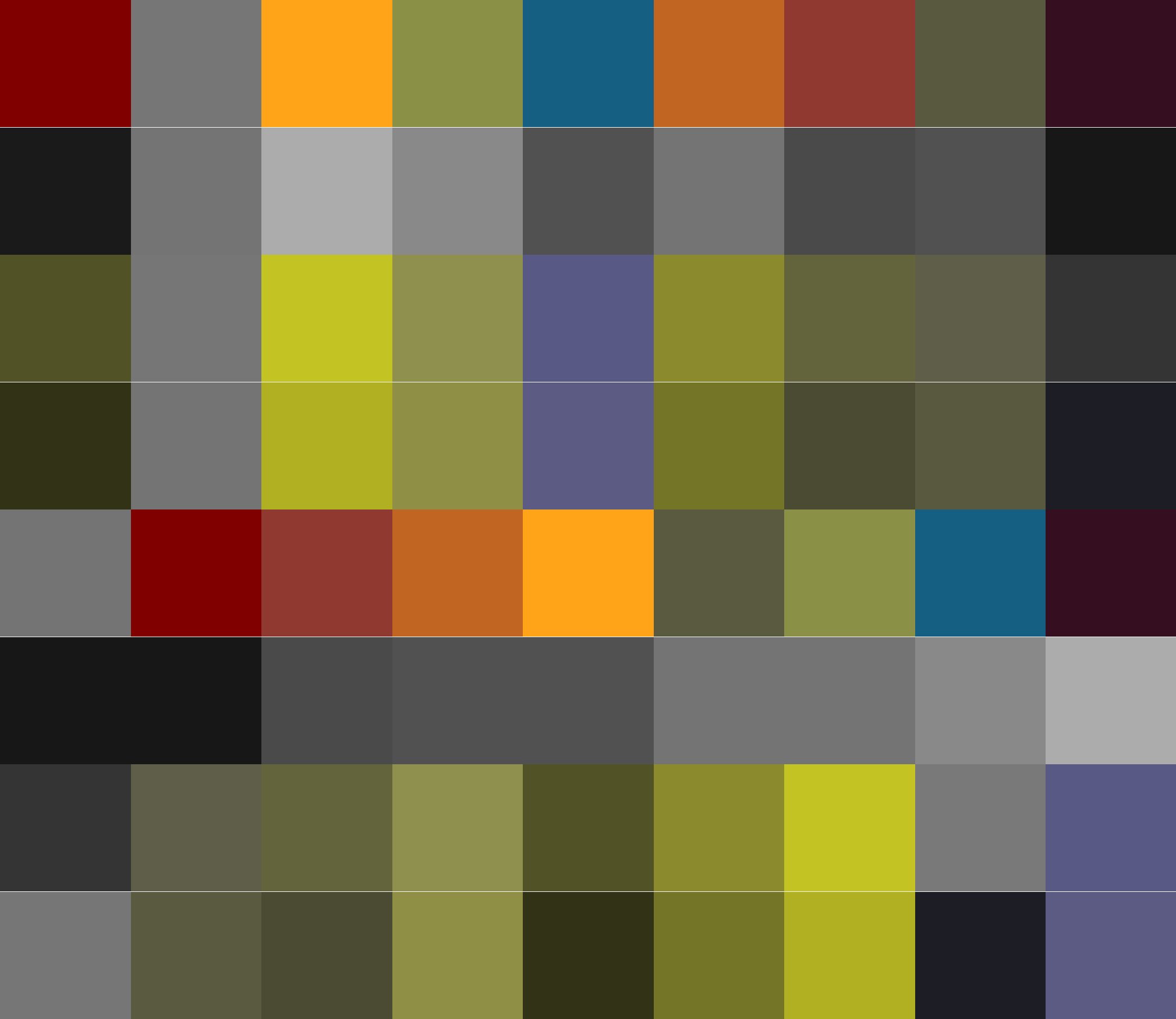
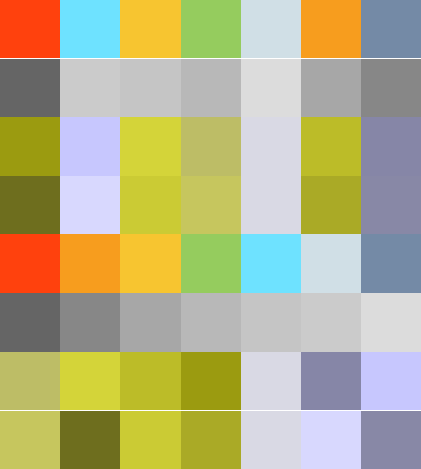
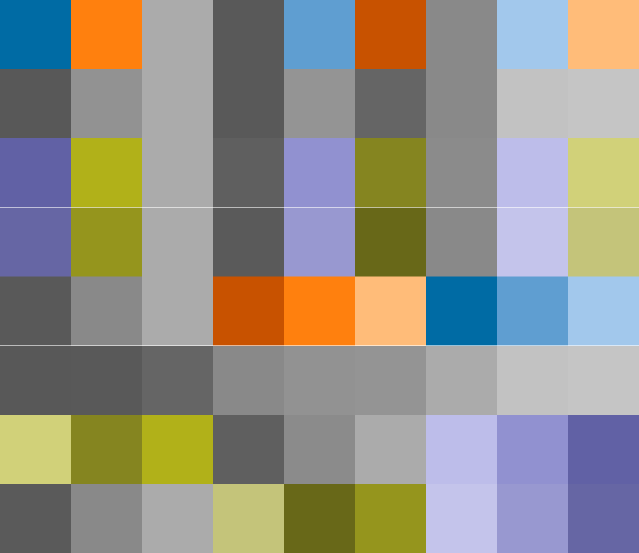
For fans of muted, calm colors, I have created fancy and tarnish palettes.
Fancy, 6 colors Tarnish, 6 colors

Here are the RGB values for all the colors in an easy-to-copy format:
Here is an example of my normal color palette in action:

Berlin public railway map.
If you are interested in the palette creation process, read up below!
Reasoning
We need to make our charts, graphics, and illustrations clear and understandable by using distinct colors that are visible in most circumstances. For example, ACM Accessibility Recommendations outline the following concerns (paraphrasing mine):
- People with Color Vision Deficiency (CVD) cannot distinguish some colors
- Colors become indistinguishable shades of gray in black and white printing
- Colors become indistinguishable on devices with less-than-optimal color transmission (mobile screens, old printers, CRT monitors et cetera)
ACM recommends using ColourBrewer for colour palettes.
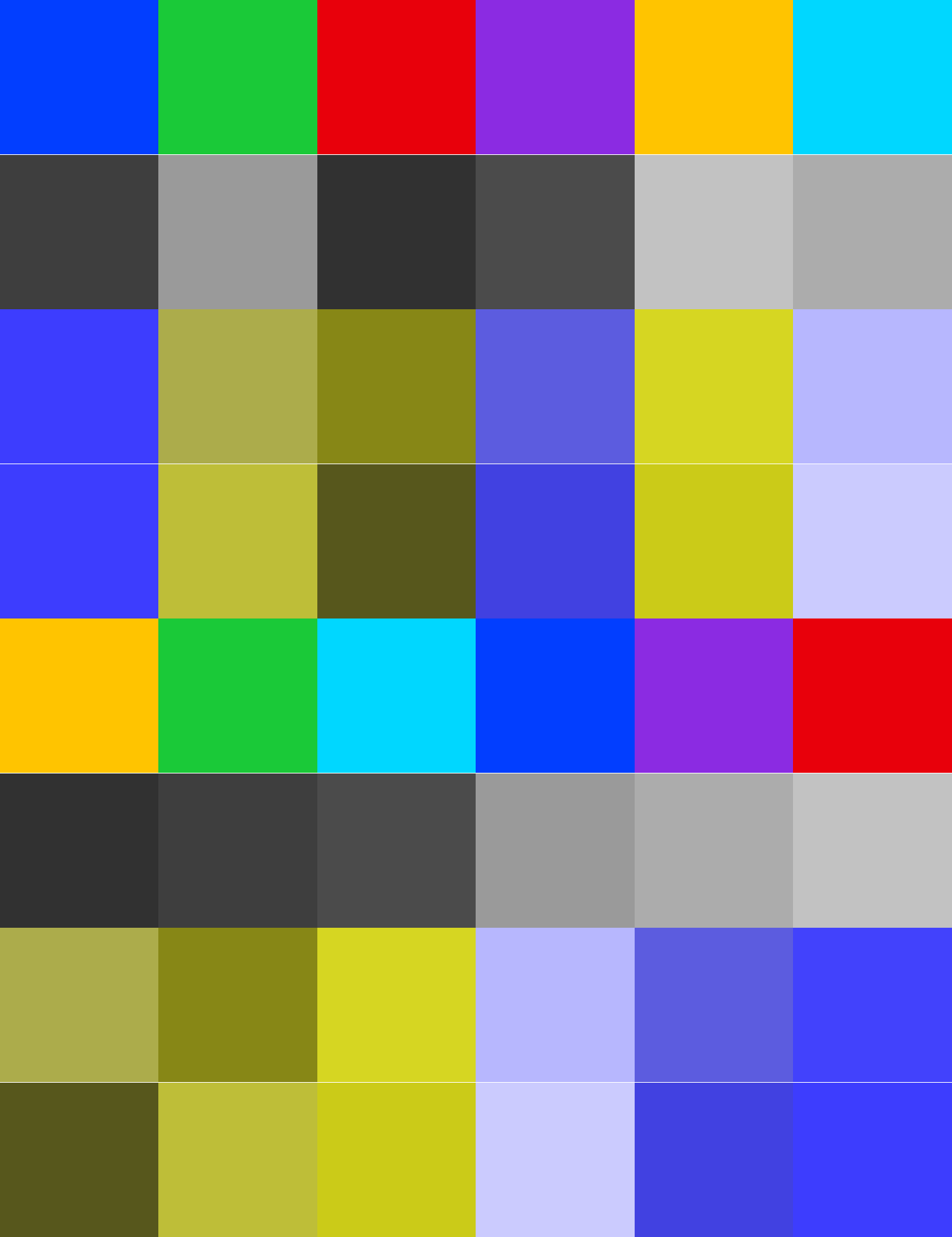
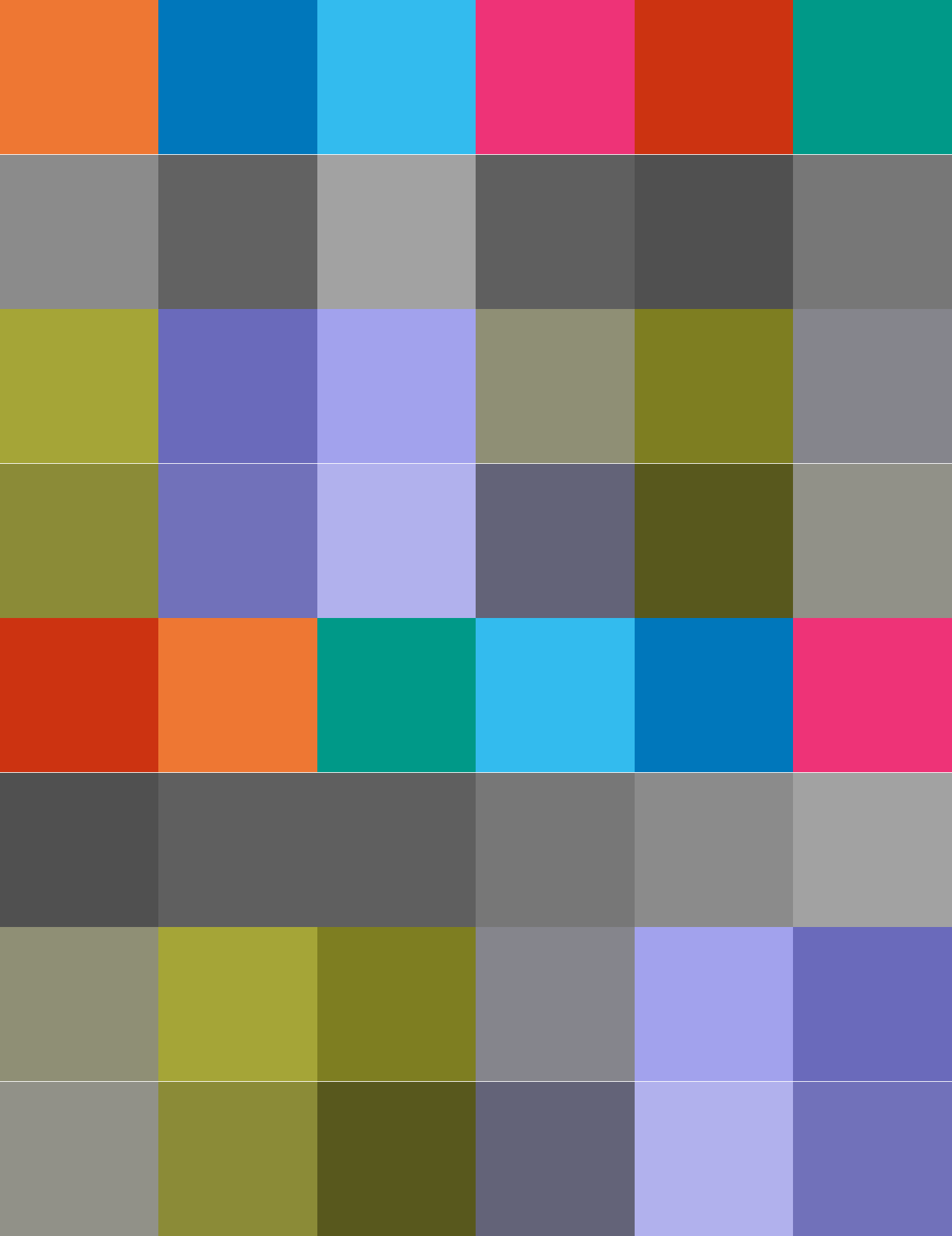
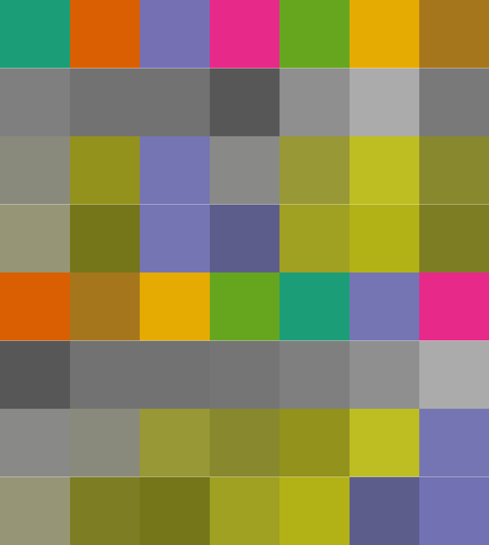
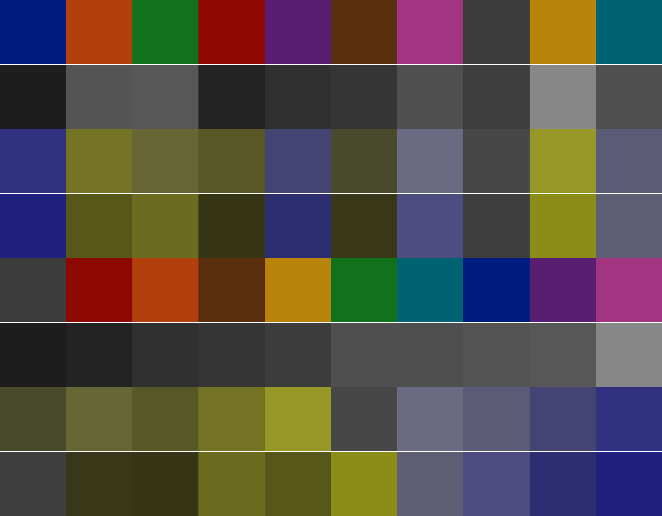
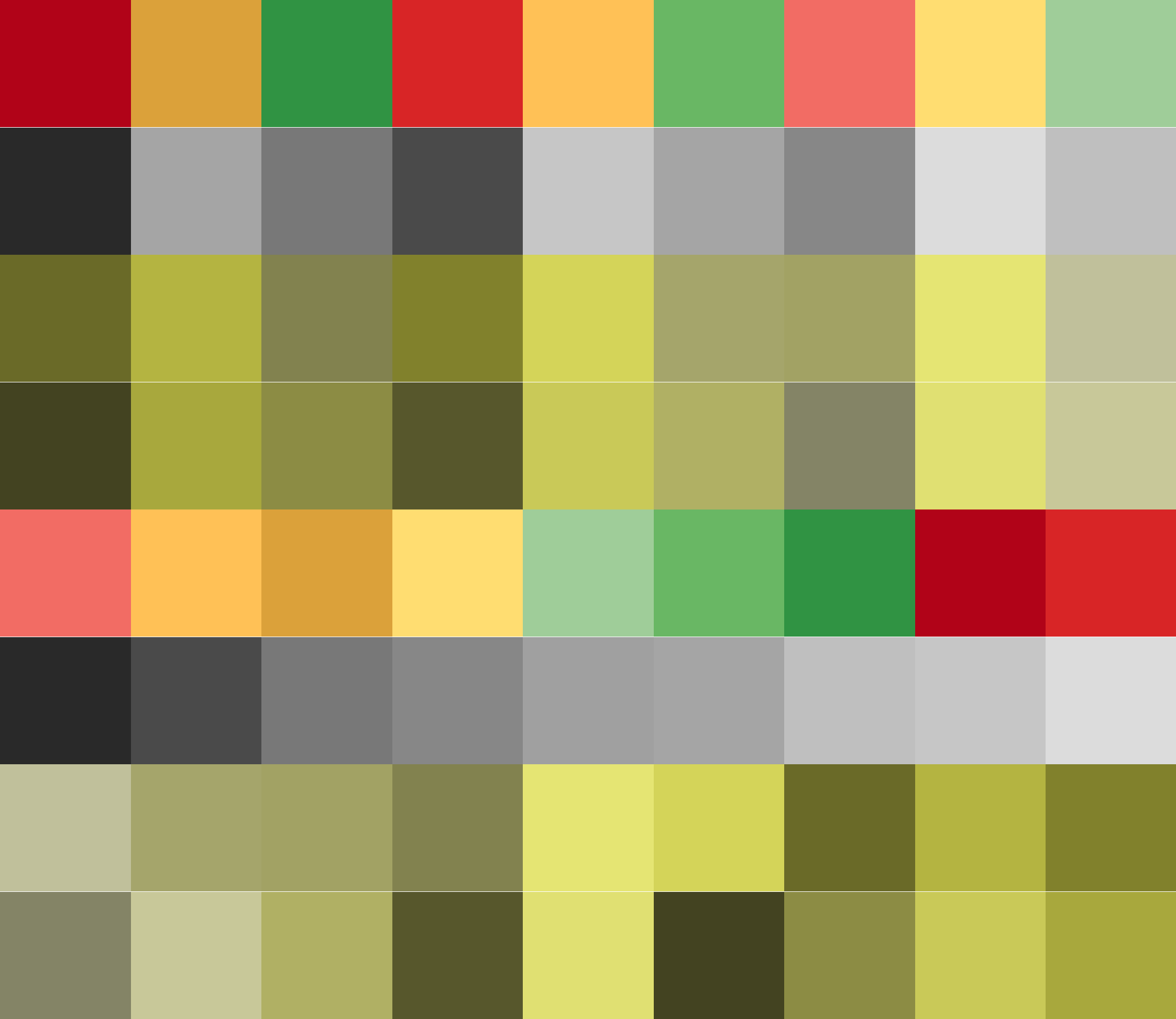
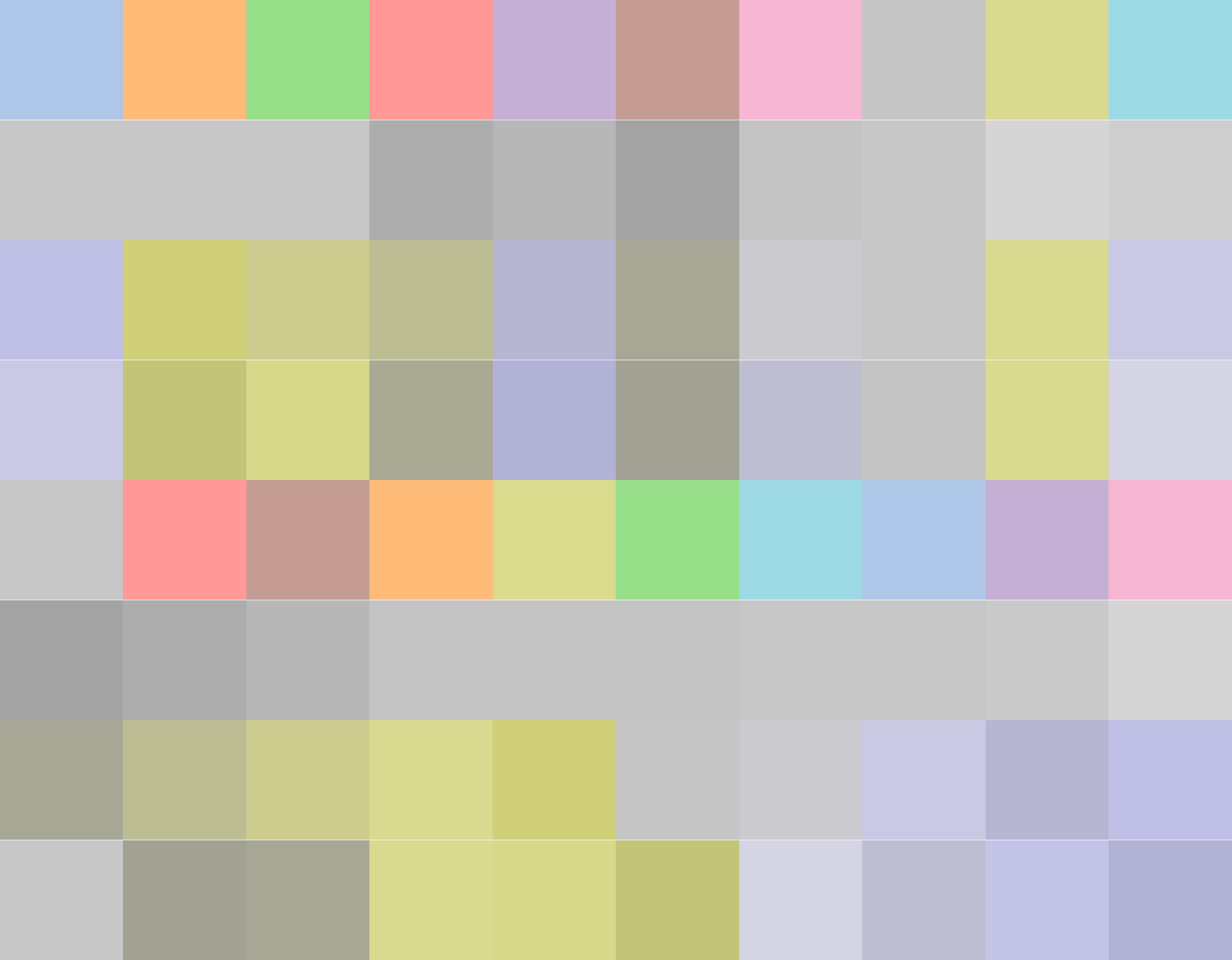
I am most interested in so-called qualitative color palettes, meaning categorical data, where there is no meaningful notion of the difference between objects. For papers, this means illustrations, text, and highlights. I used the most common Set1 palette. It has 9 colors, and looks bright and pretty:

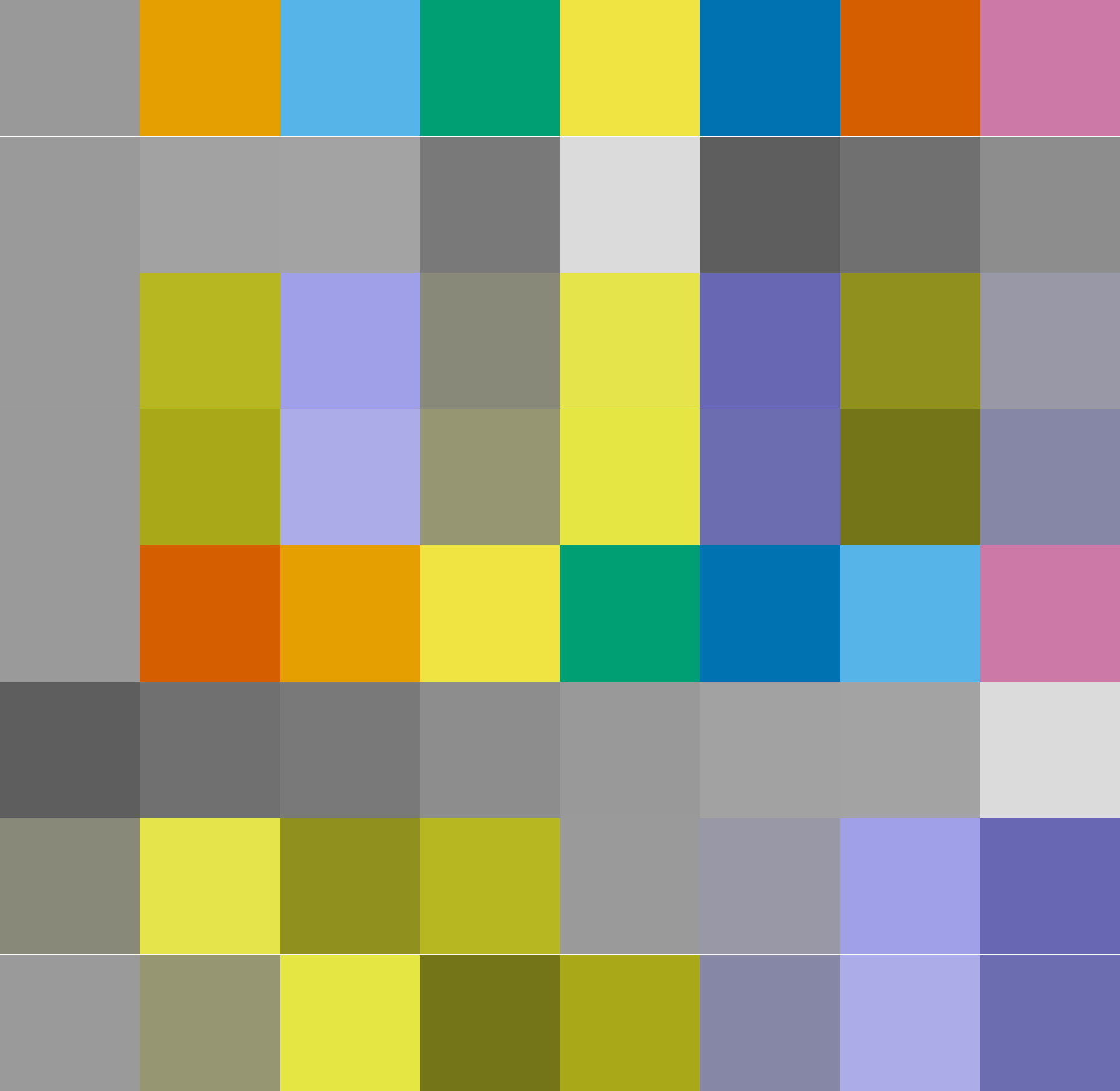
For example, here is a figure from NetLSD using Set1:

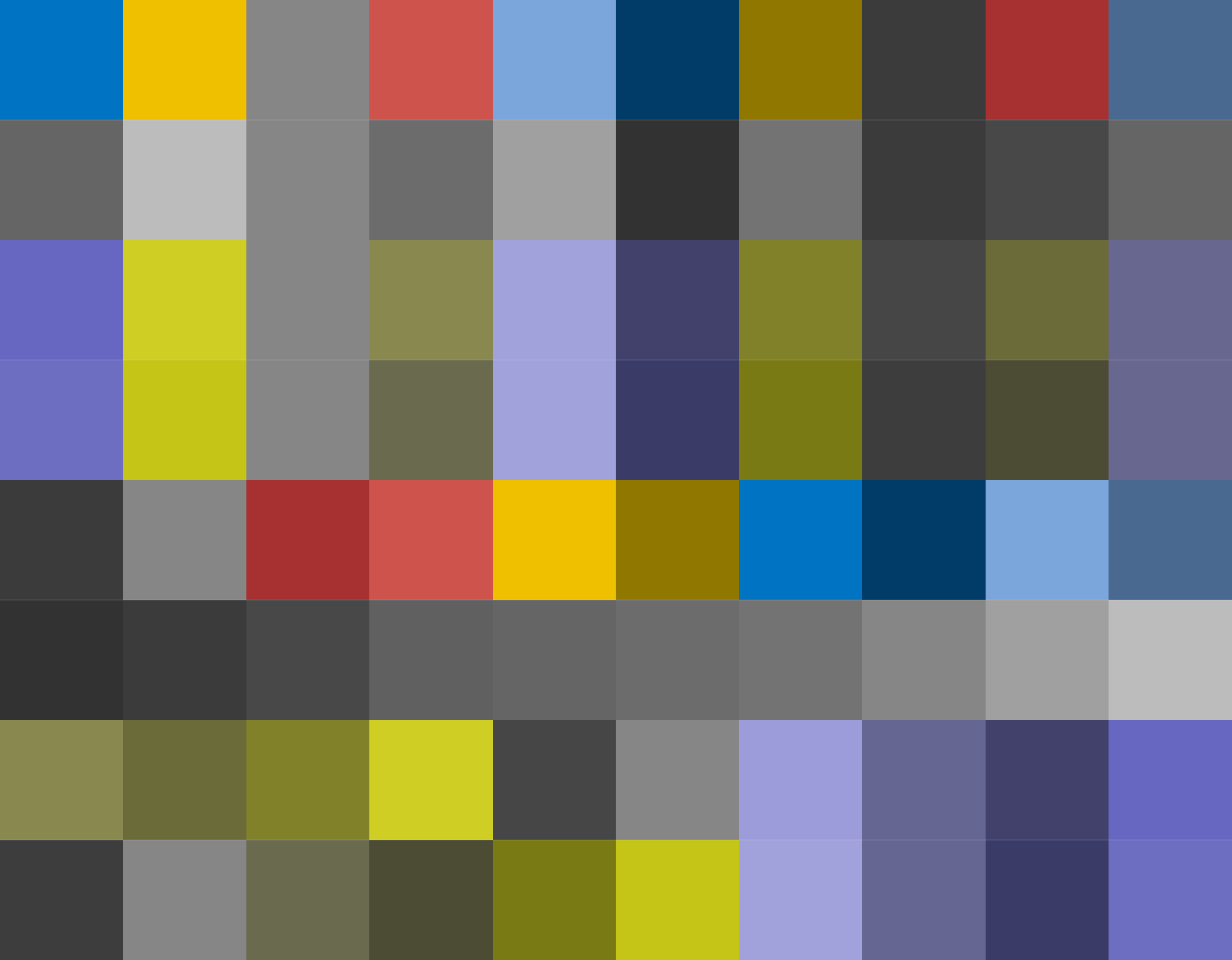
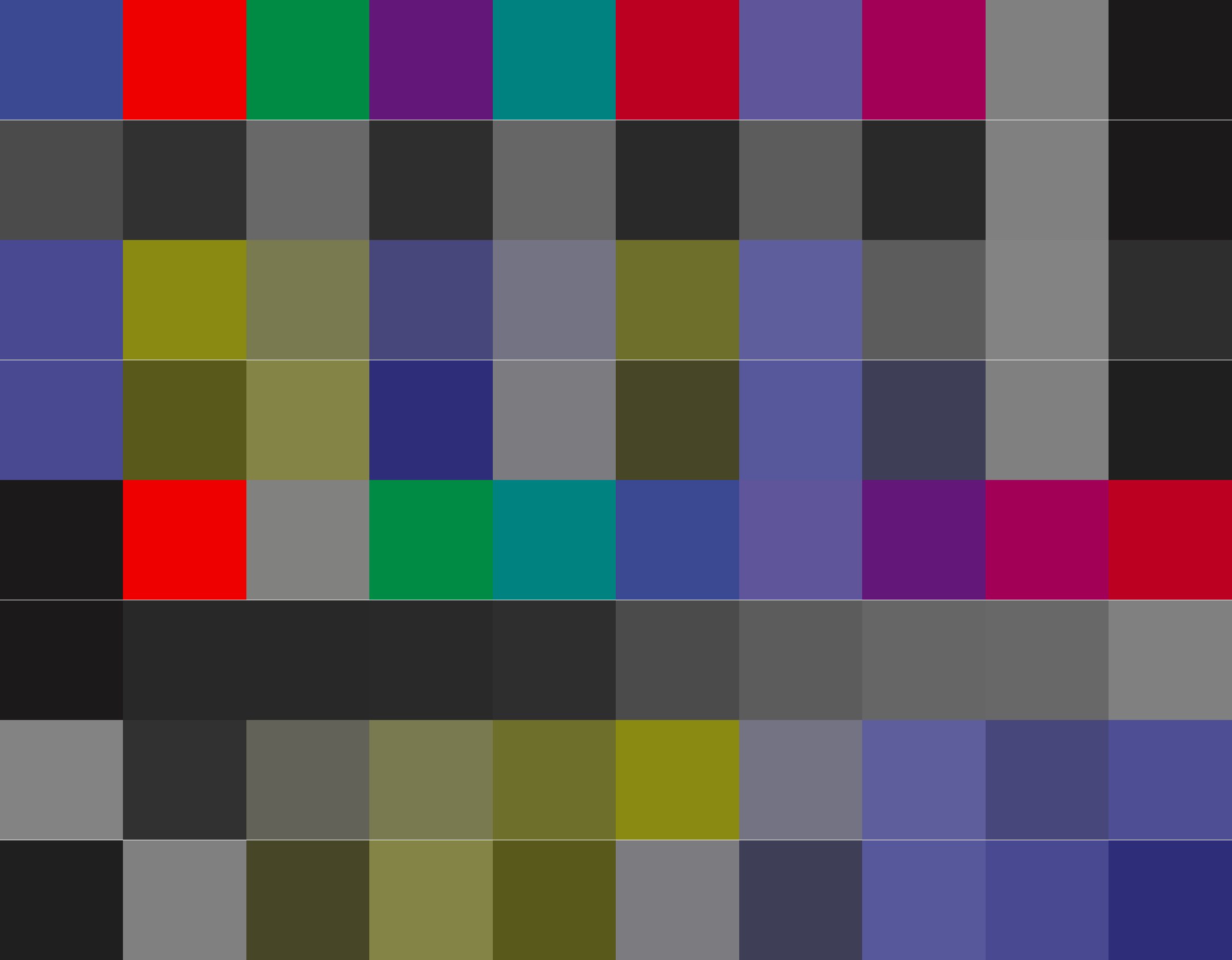
Notice any problems? I did not for almost three years, but let’s look on the same color palette printed in black and white:

Colors are not really distinguishable in black-and-white. This should not come as surprise, given that it is not listed as print-friendly on the colourbrewer website. Still, I was confused, so I started looking for better alternatives.
I have found out that most visualization opt for colourbrewer sets: matplotlib, ggplot2 being two most notable examples. Still, there is quite a lot of variety offered by more advanced solutions, including Tableau, Paul Tol’s palettes, and Seaborn. Nan Xiao and Miaozhu Li created the ggsci package collecting colour schemes from the most prestigious biomedical journals including The Lancet, and Nature. In total, I have collected over 60 palettes from all the different sources. I figured I need to read a little bit more theory in order to understand the differences.
Theory
Thankfully, there is a vast amount of literature on human perception of color. People write research papers, articles, and books on the science of color. Turns out there are formulas for everything from a good notion of perceptual distance to color vision deficiencies simulations! I will outline them below
Perceptual color distance
The [International Commission on Illumination](International Commission on Illumination) defined three standards known as CIE76, CIE94 and CIEDE2000. All of them provide some notion of colour difference. CIEDE2000 is a complex formula that I can not reproduce here; however, it is available in the Python colormath package. Here is the chart of fully saturated, bright colors:

CIELAB2000 color difference, darker is bigger. We easily distinguish green from other colors, but shades of green are more problematic.
And here is one for shades of gray:

CIELAB2000 color difference, darker is bigger.
CIEDE2000 correlates well with the recent research on the color perception - humans easily distinguish shades of green from other colors, thanks to us living in the forests millions of years ago. It provides a universal distance between colors.
CVD simulation
There are two most common types of color vision deficiencies: so-called green-blindness and red-blindness. Green-blindness affects ~6% of males and 0.5% of European females carry this type of color deficiency. Red-blindness is much more rare with 2.5% male and negligible % of women affected.
I borrowed the colorblindness simulation formulas from the Paul Tol’s website. Originally, they are from the “Digital Video Colourmaps for Checking the Legibility of Displays by Dichromats” study. For \( R,G,B\in[0, 255] \) we can get the values \( R’,G’,B’ \) approximating the green-blindness by the following formula:
$$ \begin{aligned} R’ &= (4211.11 &+ 0.2802*R^{2.2} &+ 0.677*G^{2.2} & )^{{1}/{2.2}} \\ G’ &= (4211.11 &+ 0.2802*R^{2.2} &+ 0.677*G^{2.2} & )^{{1}/{2.2}} \\ B’ &= (4211.11 &- 0.0214*R^{2.2} &+ 0.0214*G^{2.2} &+ 0.95724*B^{2.2} )^{{1}/{2.2}} \end{aligned}$$
Analogously, for the red-blindness:
$$ \begin{aligned} R’ &= (782.74 &+ 0.1115*R^{2.2} &+ 0.8806*G^{2.2} & )^{{1}/{2.2}} \\ G’ &= (782.74 &+ 0.1115*R^{2.2} &+ 0.8806*G^{2.2} & )^{{1}/{2.2}} \\ B’ &= (782.74 &+ 0.003974*R^{2.2} &- 0.003974*G^{2.2} &+ 0.992052*B^{2.2} )^{{1}/{2.2}} \end{aligned}$$
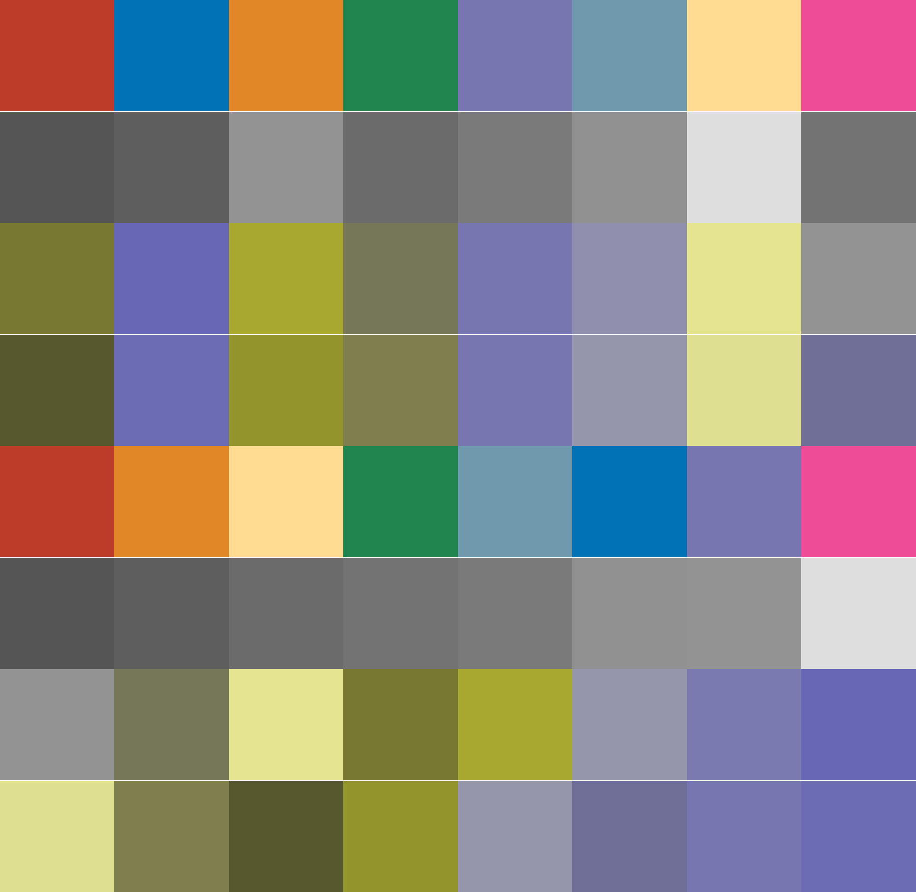
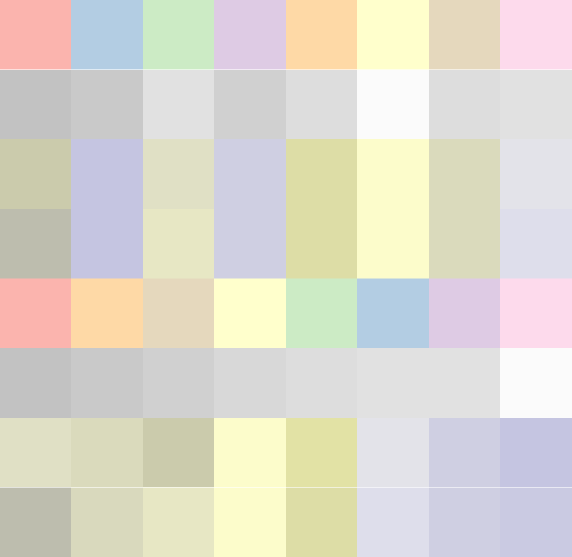
Here is an illustration on how people with green- (middle row) and red-blindness (bottom row) perceive colourbrewer’s Set1 palette:

Notice how the first five colors are completely indistinguishable for people with CVD. While I can create charts like this with CVD and grayscale simulations, I can only rely on perceptual metrics in choosing (or designing) an optimal colourmap.
State of the art
I have found out that most of the colour schemes do not address some of the desired qualities for the qualitative colormaps. Ones that have some information about how they were built (most do not) are built manually by picking colors from some predefined set. Although some look quite beautiful, I had no mechanism to check whether one palette is better than another. I had to devise a set of objectives.
Building an optimal color palette
Most rules for designing an efficient color map can be encoded quantitatively and optimized for. The only attempt of doing such optimization fully end-to-end is i want hue. It focuses on generating random color palettes, so it merely presents a heuristic and does not define a proper objective function.
The Objective Function
I have assembled a list of common requirements:
- Colours should be distinct from each other
- Colours should be distinct in black and white printing
- Colours should be distinct for people with CVD
- Colours should be distinguishable from both white and black
- Colours should be somewhat uniform - no single color should stand out
First four objectives can be easily turned into code with the CIEDE2000 and CVD simulation techniques I have described above, the last one is more problematic. i want hue proposes to use CIE Lab* colour space for setting constraints to make sure that the colors look uniform. Paul Tol suggests that “colours with the same product of saturation S and value V in the HSV colour system (same vividness) match well together.” I have found out that this does not hold quite a well in the LCHa*b* colour space, the colorfulness constraint is enough in my opinion.
The perfect colour space
LCHa*b* can be thought of as an unbiased version of the well-known HSV colour space. It has three components: hue, chroma, and lightness. Chroma and lightness were specifically debiased to match the human perception of colour, allowing us to set the constraints on the colour scheme in a natural way. A visual introduction to this colour space can be found at the i want hue website.
For my color palettes, I made the following choices:
| Name | \( H \) | \( C \) | \( L \) |
|---|---|---|---|
| Normal | \( 0-360 \) | \( 50-75 \) | \( 40-75 \) |
| Fancy | \( 0-360 \) | \( 15-40 \) | \( 40-75 \) |
| Bright | \( 0-360 \) | \( 50-75 \) | \( 55-90 \) |
| Dark | \( 0-360 \) | \( 30-75 \) | \( 8-30 \) |
| Tarnish | \( 0-360 \) | \( 0-15 \) | \( 30-70 \) |
I have coded my objective function in Python using the colormath package. Each requirement was translated into a component of the objective function, so given some reasonable weights, I can now rank the color palettes according to it. The question remains of how can I optimize such palettes remained unanswered.
Optimization
As the objective function is independent on the ordering of the colors, we have sort of a continuous version of a combinatorial optimization problem. No simple solution exists, but I’ve found that the Powell’s method converges to the local optimum quite fast. For the small number of colors, I generate initial guesses as random permutations covering the whole hue spectrum. Then, I reordered the colors to have the maximum average score for each sub-palette.
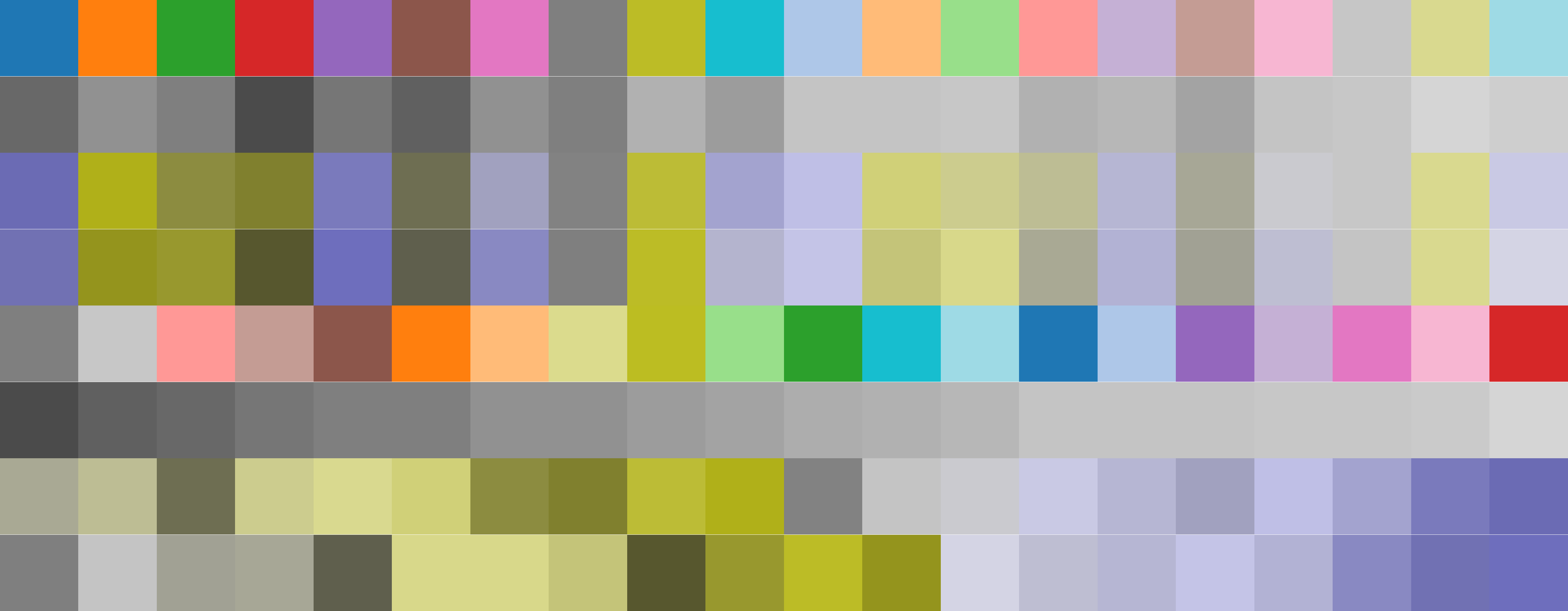
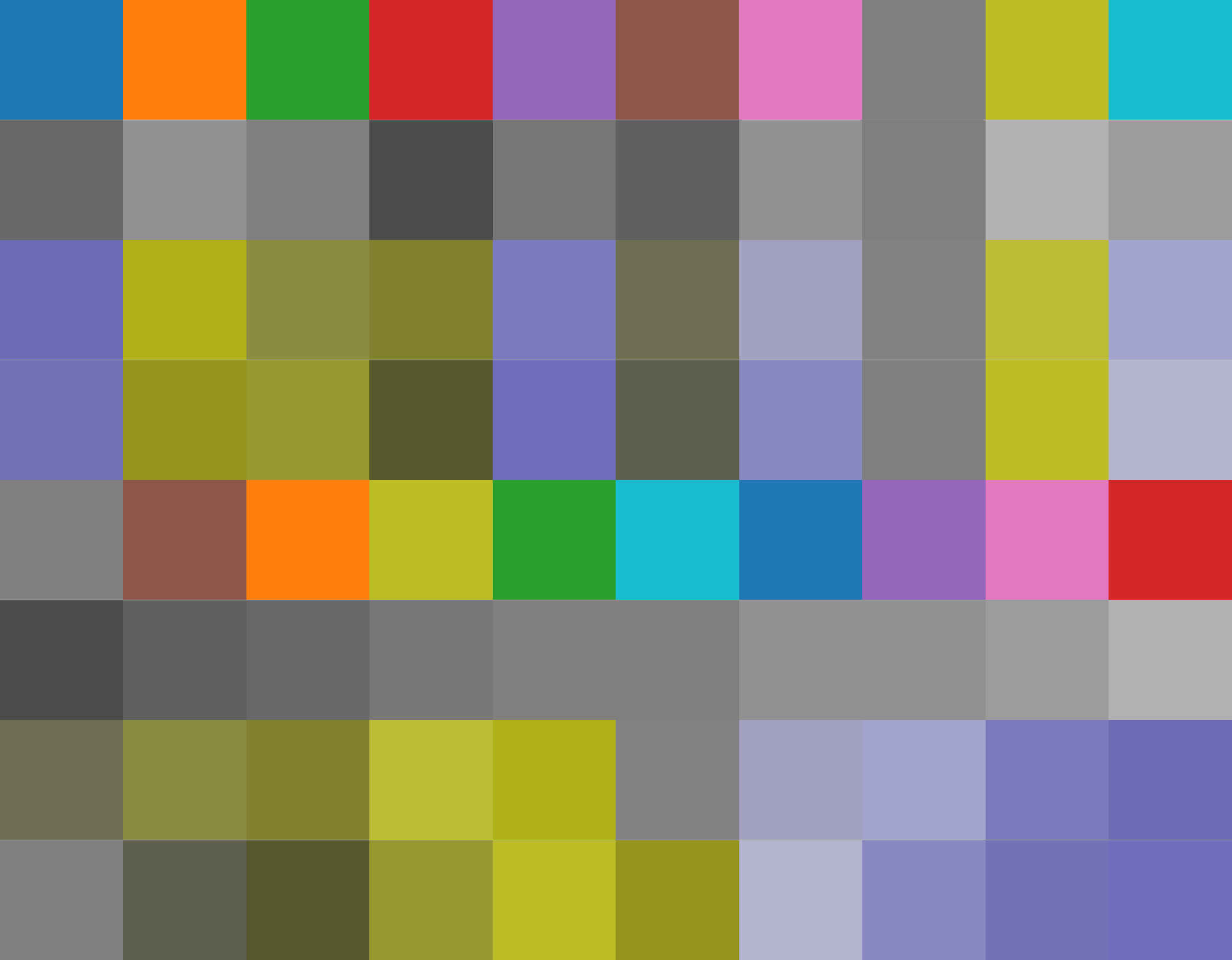
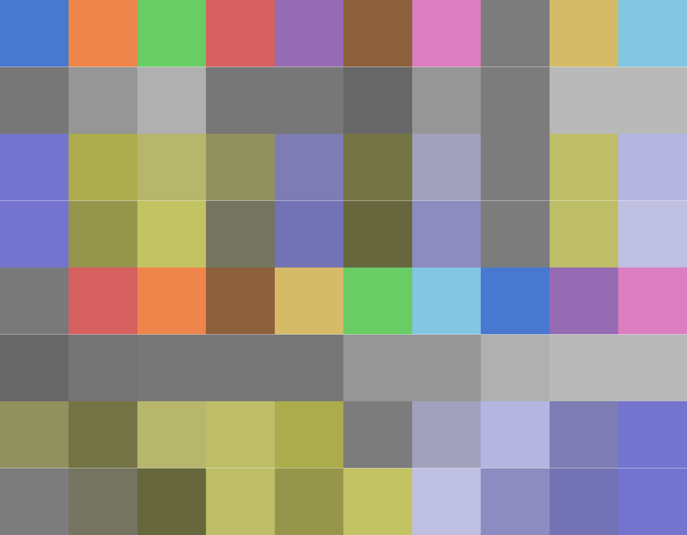
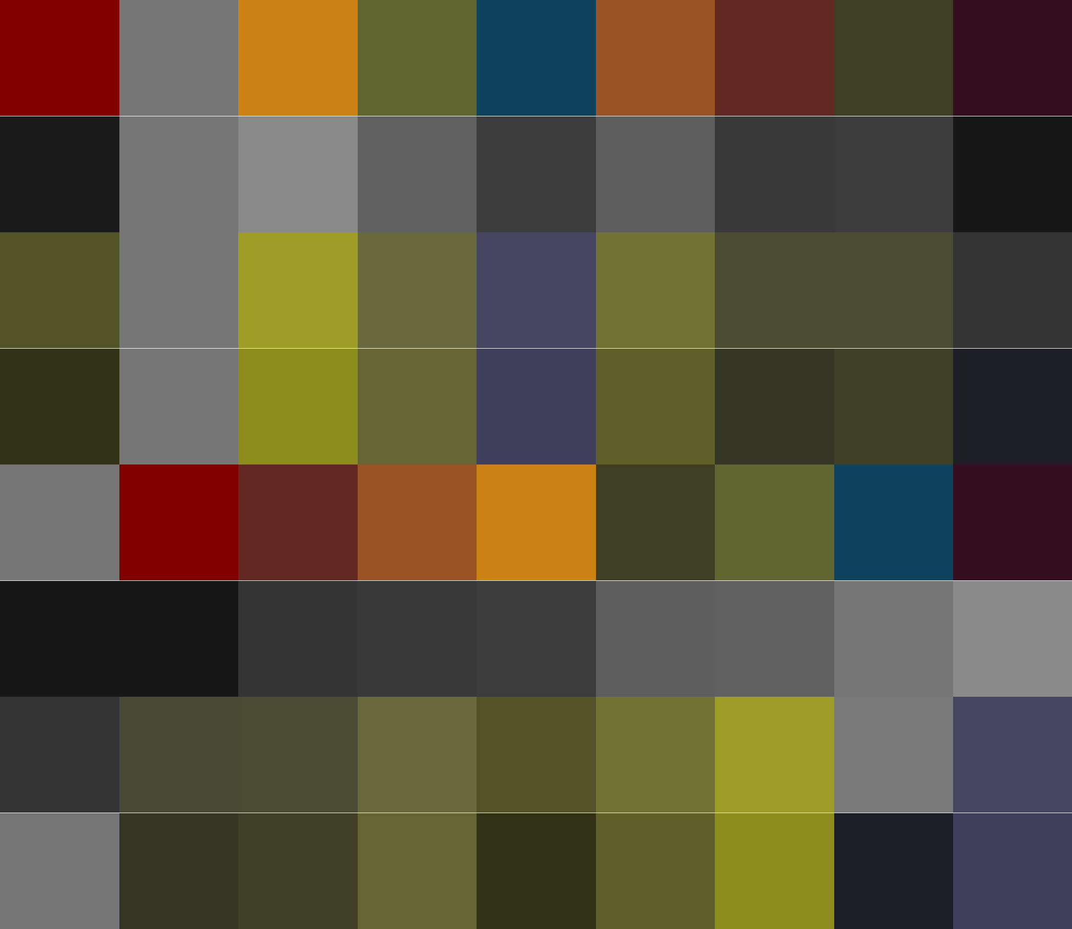
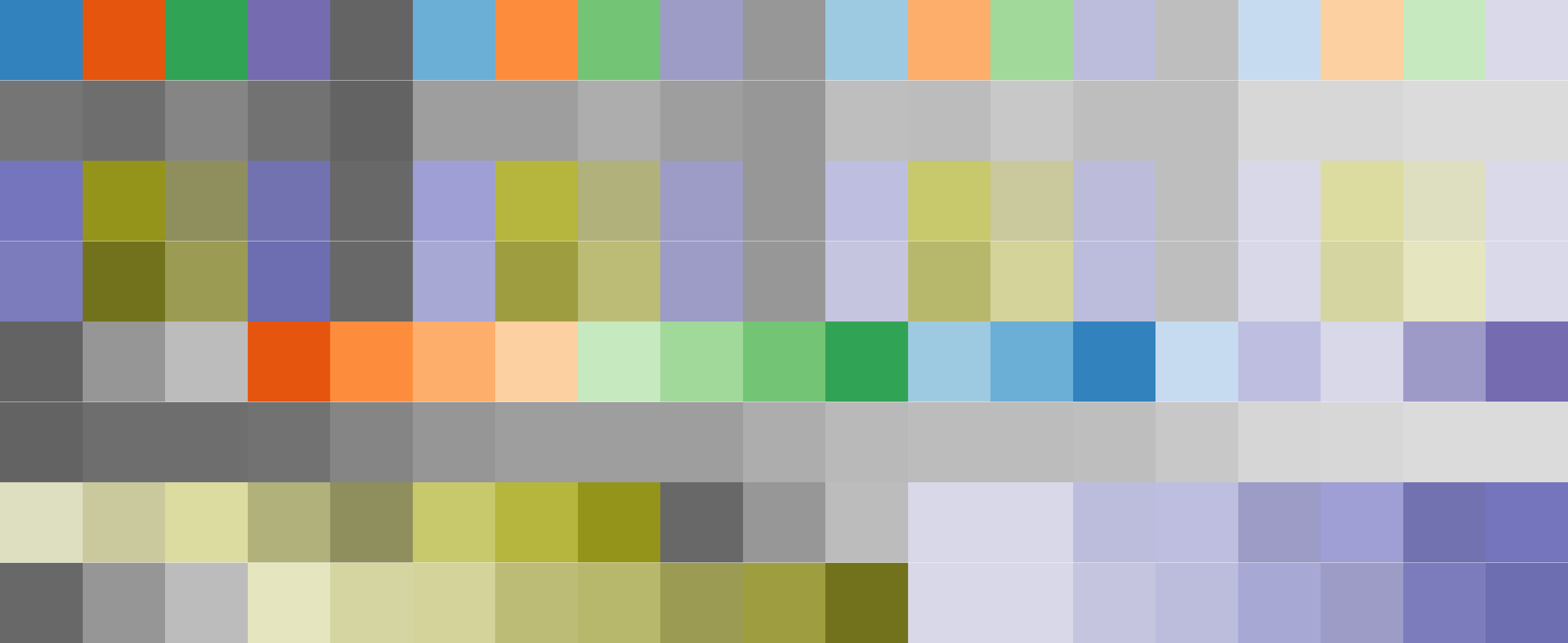
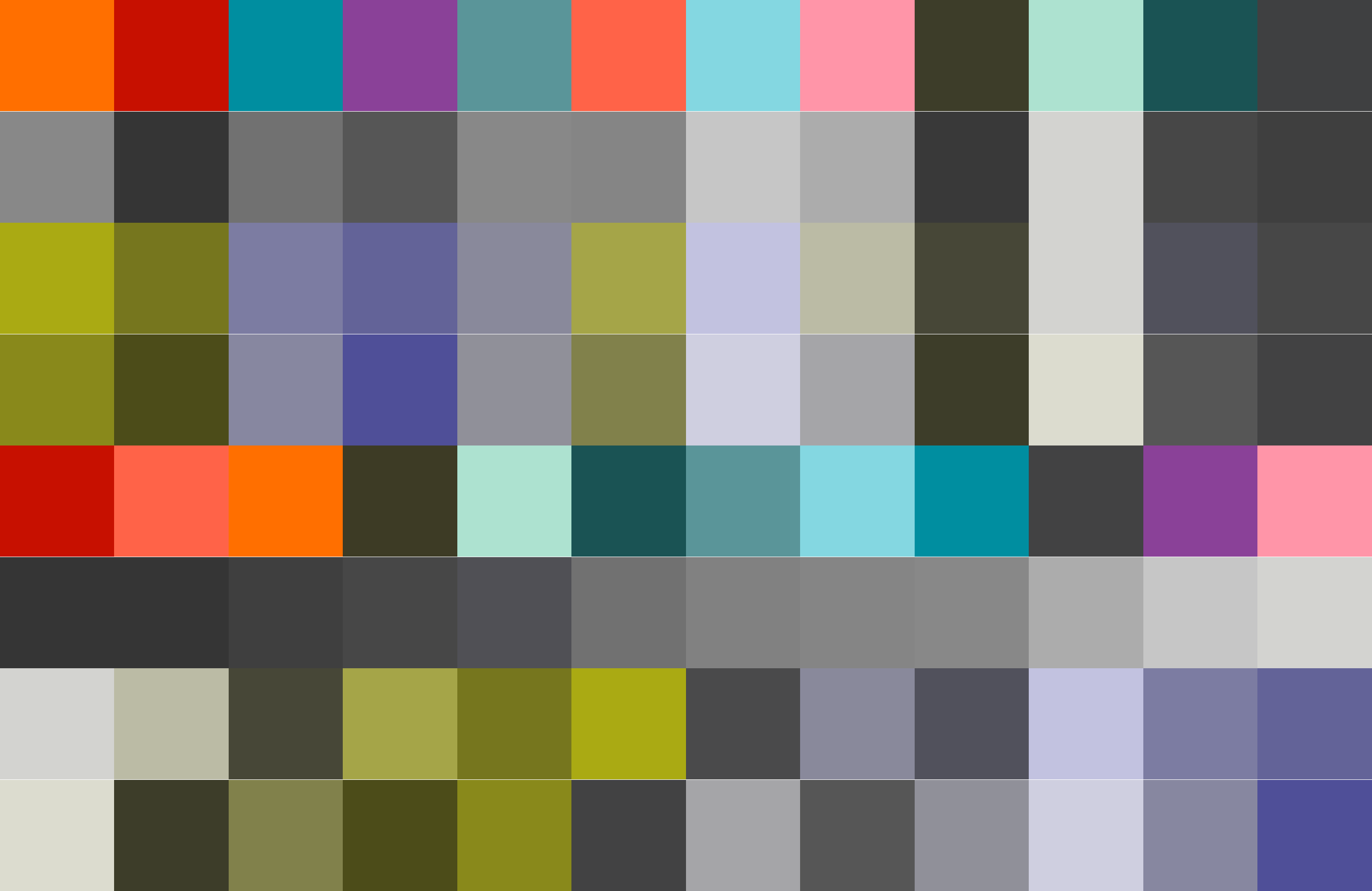
Results
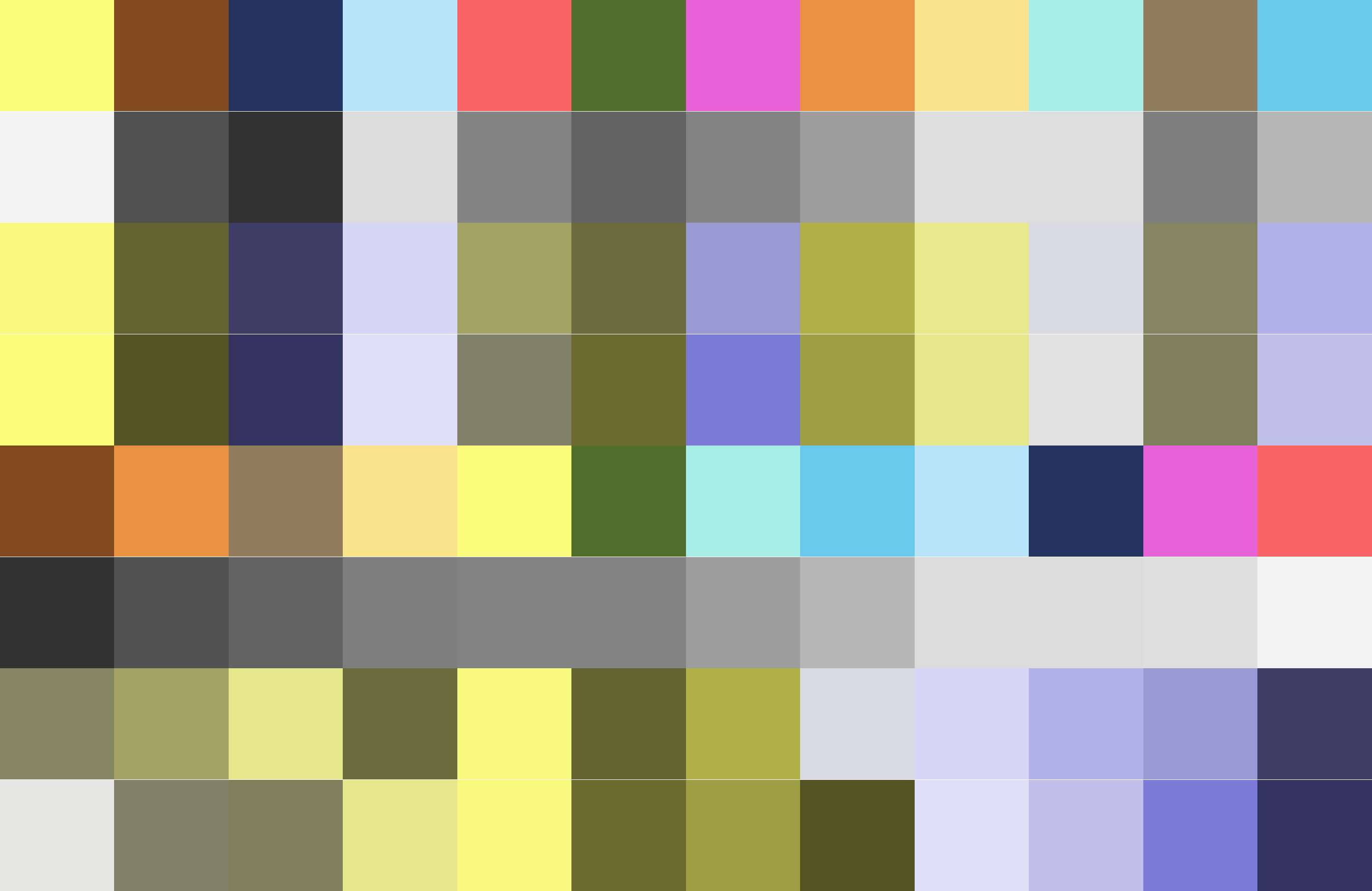
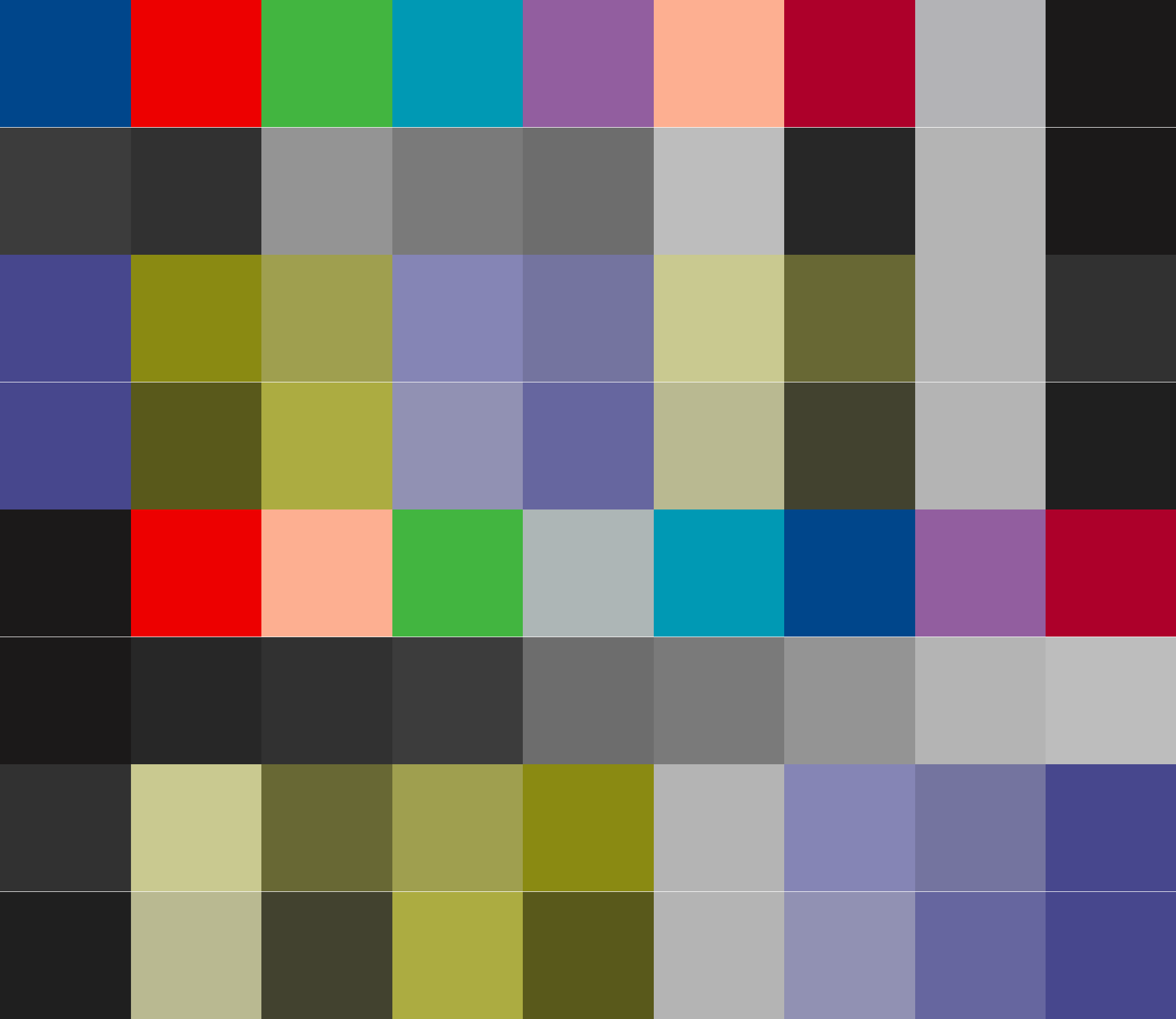
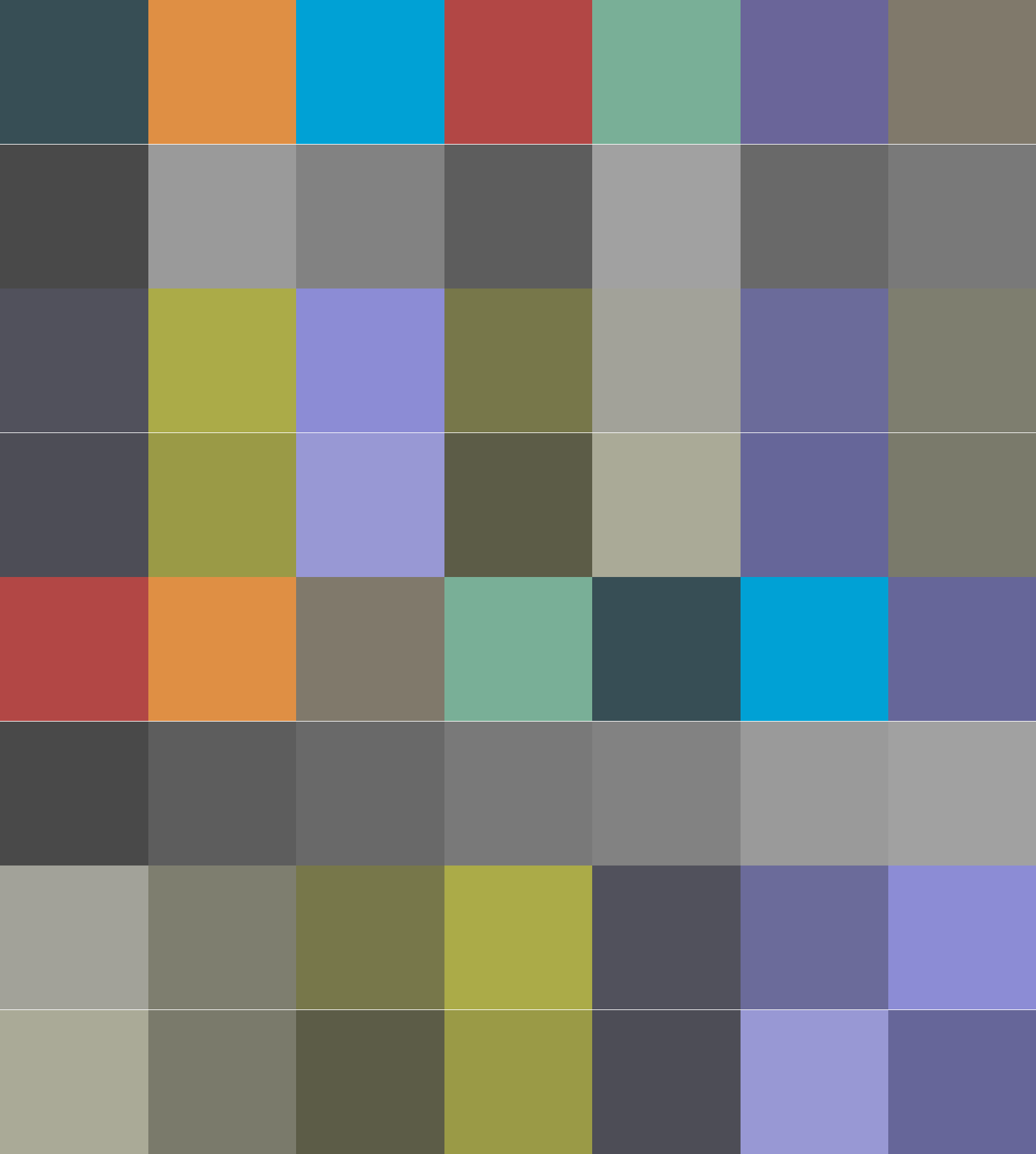
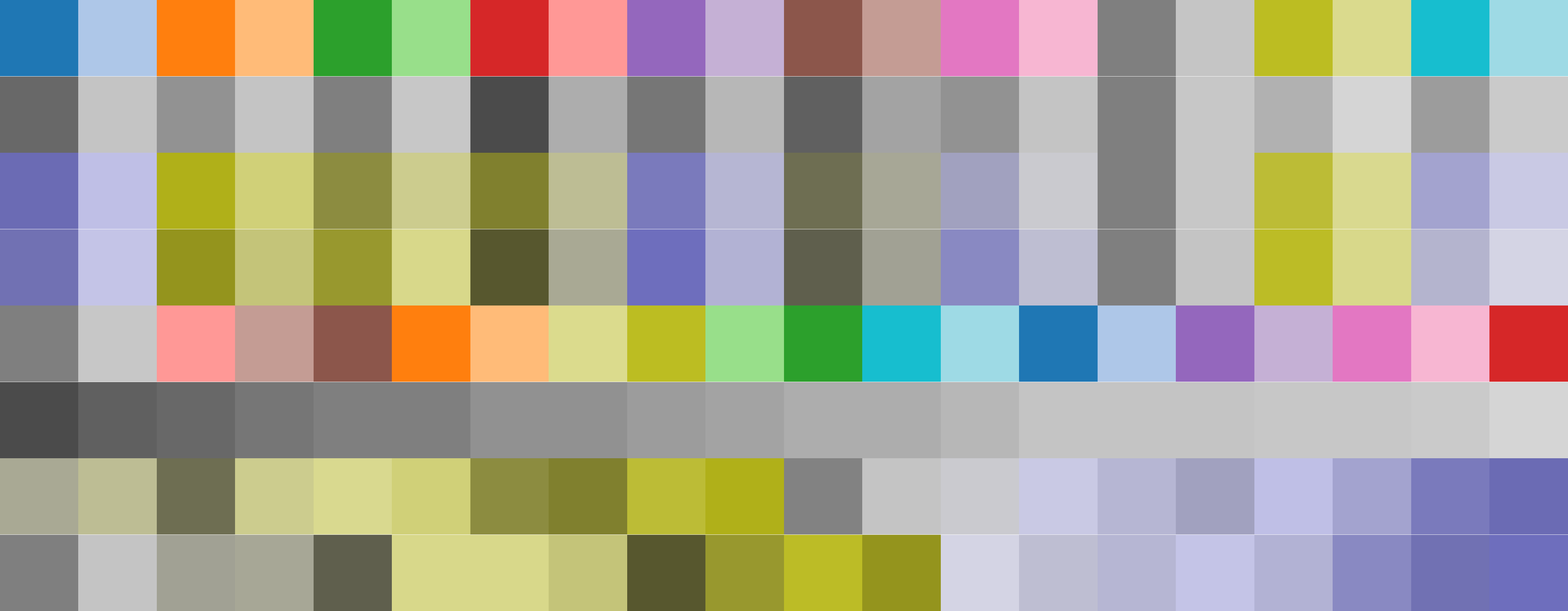
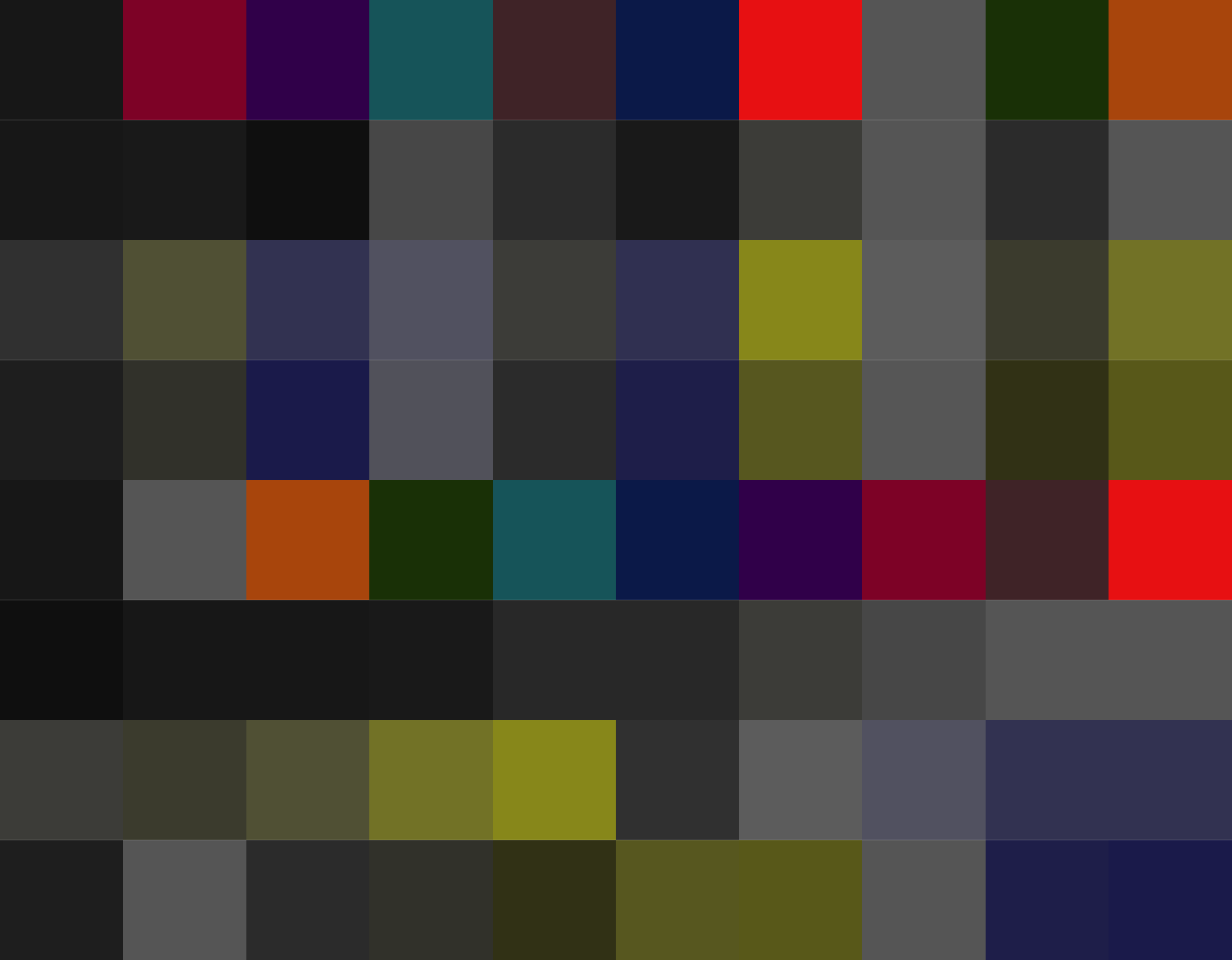
Here I list all my palettes converted too imitate black-and-white printing and CVD.
Normal, 6 colors Normal, 12 colors Bright, 6 colors Dark, 6 colors Fancy, 6 colors Tarnish, 6 colors


Rankings
Additionally, I list all the collected palettes, ranked according to the objective function. RGB values for all palettes can be found here.
Palette name links to the corresponding scheme alongside its CVD and grayscale simulations. Last 4 rows are sorted in order to spot close colors easily.
| Name | 4 colors | 6 colors | 8 colors | 12 colors |
|---|---|---|---|---|
| xgfs_normal6 | 27.65 | 25.26 | — | — |
| xgfs_bright6 | 25.34 | 23.89 | — | — |
| xgfs_fancy6 | 24.40 | 22.55 | — | — |
| xgfs_normal12 | 27.10 | 21.57 | 20.56 | 18.63 |
| ggsci_rick_morty | 29.30 | 21.49 | 18.84 | 15.46 |
| paultol_muted | 25.59 | 20.52 | 17.62 | — |
| ggsci_uscs_genome | 13.97 | 20.25 | 17.59 | 15.62 |
| colorbrewer_set1 | 21.09 | 19.11 | 16.60 | — |
| seaborn_bright6 | 18.04 | 19.11 | — | — |
| xgfs_dark6 | 19.49 | 19.06 | — | — |
| xgfs_tarnish6 | 18.42 | 18.71 | — | — |
| ggsci_lancet_oncology | 22.32 | 18.40 | 17.07 | — |
| ggsci_locuszoom | 19.11 | 18.24 | — | — |
| ggsci_jama | 20.97 | 17.98 | — | — |
| seaborn_colorblind6 | 21.09 | 17.92 | — | — |
| colorbrewer_accent | 15.23 | 17.75 | 17.07 | — |
| seaborn_bright | 19.39 | 17.57 | 16.90 | — |
| paultol_vibrant | 19.46 | 17.43 | — | — |
| ggsci_clinical_oncology | 18.98 | 16.82 | 14.79 | — |
| ggsci_star_trek | 23.67 | 16.77 | — | — |
| colorbrewer_dark2 | 18.54 | 16.67 | 14.59 | — |
| okabe | 14.34 | 16.50 | 15.23 | — |
| seaborn_muted6 | 16.21 | 16.39 | — | — |
| ggsci_igv | 20.38 | 16.34 | 16.06 | 14.89 |
| ggsci_d3js_cat10 | 18.30 | 16.24 | 14.52 | — |
| ggsci_d3js_cat20 | 18.30 | 16.24 | 14.52 | 14.60 |
| tableau_10 | 18.30 | 16.24 | 14.52 | — |
| tableau_blue_red_6 | 15.82 | 16.24 | — | — |
| seaborn_muted | 15.74 | 16.15 | 15.15 | — |
| ggsci_new_england_journal_of_medicine | 17.38 | 16.12 | 16.62 | — |
| colorbrewer_paired | 18.62 | 15.77 | 15.55 | 15.61 |
| ggsci_uchicago | 20.13 | 15.69 | 13.46 | — |
| tableau_green_orange_6 | 19.17 | 15.67 | — | — |
| seaborn_dark6 | 15.01 | 15.60 | — | — |
| ggsci_nature_review_cancer | 21.48 | 15.54 | 14.54 | — |
| colorbrewer_set2 | 16.01 | 15.43 | 13.31 | — |
| tableau_purple_gray_12 | 11.75 | 15.40 | 11.98 | 10.78 |
| seaborn_deep6 | 13.87 | 15.23 | — | — |
| ggsci_cosmic_hallmark_3 | 22.48 | 15.13 | — | — |
| ggsci_uchicago_light | 16.29 | 15.03 | 12.83 | — |
| ggsci_cosmic_hallmark_2 | 13.22 | 15.02 | 14.87 | — |
| ggsci_tron | 19.38 | 14.95 | — | — |
| seaborn_dark | 13.80 | 14.93 | 14.72 | — |
| colorbrewer_set3 | 17.81 | 14.88 | 13.49 | 13.04 |
| paultol_light | 17.86 | 14.81 | 13.53 | — |
| tableau_blue_red_12 | 18.87 | 14.74 | 13.05 | 11.70 |
| ggsci_aaas | 16.47 | 14.72 | 14.44 | — |
| ggsci_simpsons | 15.08 | 14.61 | 13.17 | 15.49 |
| seaborn_colorblind | 15.78 | 14.31 | 13.37 | — |
| ggsci_uchicago_dark | 18.18 | 14.29 | 12.35 | — |
| ggsci_d3js_cat20c | 14.73 | 14.09 | 14.33 | 12.21 |
| ggsci_futurama | 19.69 | 14.07 | 13.95 | 15.00 |
| seaborn_deep | 14.30 | 14.04 | 14.01 | — |
| seaborn_pastel6 | 12.60 | 14.04 | — | — |
| tableau_10_medium | 15.52 | 13.94 | 13.03 | — |
| tableau_20 | 14.88 | 13.70 | 14.68 | 13.91 |
| tableau_color_blind_10 | 16.17 | 13.65 | 11.13 | — |
| tableau_purple_gray_6 | 14.39 | 13.61 | — | — |
| tableau_traffic_light | 16.01 | 13.37 | 11.71 | — |
| ggsci_d3js_cat20b | 15.47 | 13.23 | 13.62 | 13.61 |
| tableau_green_orange_12 | 11.08 | 13.07 | 13.04 | 12.61 |
| tableau_10_light | 14.38 | 12.73 | 11.66 | — |
| colorbrewer_pastel1 | 13.24 | 12.22 | 10.78 | — |
| seaborn_pastel | 12.44 | 11.96 | 11.62 | — |
| ggsci_cosmic_hallmark_1 | 16.47 | 11.76 | 12.42 | — |
| colorbrewer_pastel2 | 12.11 | 11.04 | 9.85 | — |
| paultol_high_contrast | 24.93 | — | — | — |
| tableau_gray_5 | 15.81 | — | — | — |